

Heavy is the font that wears the crown
After 17 years, Calibri’s reign as the default font in Microsoft Office has finally ended

Finally!
Thank you for your efforts, Calibri, but the time has come to bid farewell.
This week, I was delighted to find that an Office software update had replaced the default font from Calibri to Aptos.
I hadn’t consciously realised until Microsoft made the announcement back in 2021 that the default font in Microsoft Office was being replaced, how bought into the change I already was.
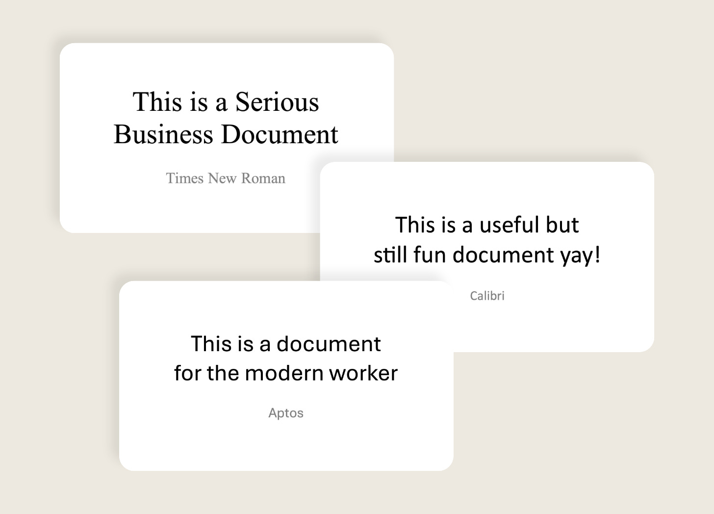
The Times New Roman they are a changin’
I clearly remember the day I first used Office 2007, which came with a new default font called Calibri.
I liked it! Calibri was a modern sans-serif departure from the austere Times New Roman, additionally softened with rounded corners that gave it a more approachable look.
This also meant it nestled comfortably alongside the overhauled Office UI which encouraged more experimentation and playfulness in document design, with its live formatting previews and In-Ribbon Gallery features.
Changing a default font is no small matter. If it does the job, many won’t bother searching through the font picker for an alternative. This means potentially millions of status reports, budgets, and school presentations, seen by billions of people, will all share the same font.
They also carry such a weight of importance because they can very quickly appear in all sorts of applications. I can’t tell you the number of times I’ve spotted a shop sign sporting a logo set in Calibri.
But as Microsoft’s design sense evolved from Aero to Metro (Modern UI) and then to Fluent, I think Calibri’s whimsical versatility made it age poorly.
The time had come for a change.
What makes Aptos a good successor to Calibri?
Aptos comprises a much more diverse family of styles than its predecessor.
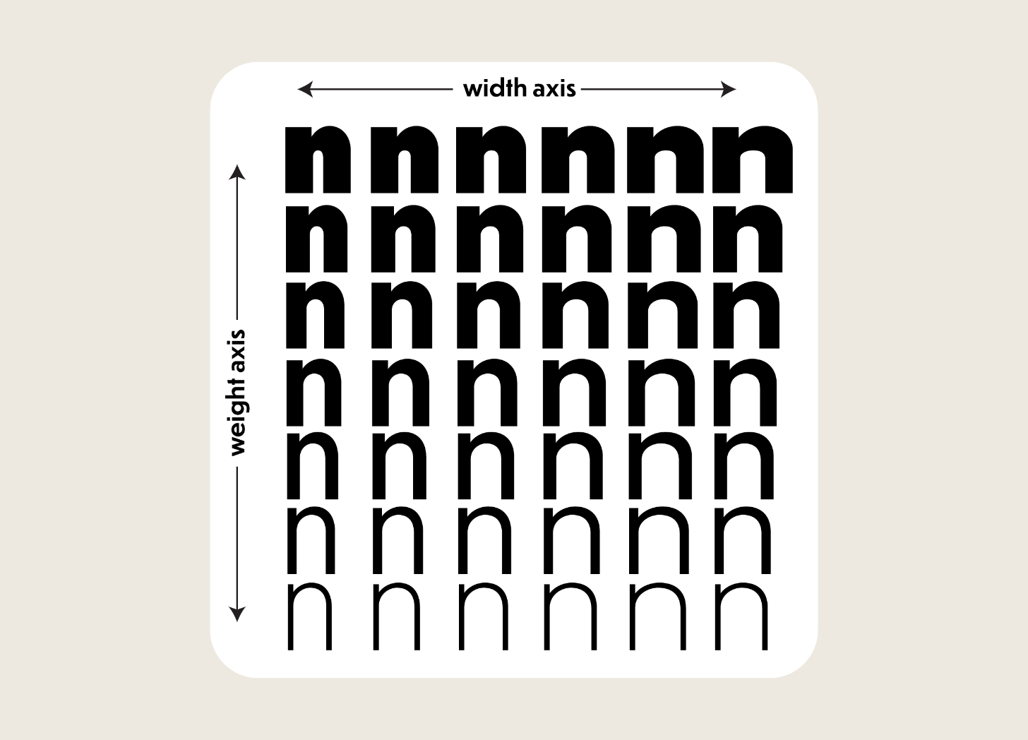
Calibri sported just 3 weights: Regular and Bold (with Light being introduced only later with Office 2013). The base sans-serif Aptos on the other hand comes not only in 6 weights (Light, Regular, SemiBold, Bold, ExtraBold, Black) in Office, but it is also a ‘variable font’. This means that its weight can be programmatically changed along a sliding scale, giving users a ton more flexibility.
And that’s not all! The Aptos family includes Aptos Display (for headings), Aptos Narrow (for condensed text), Aptos Mono (for monospaced text), and Aptos Serif.
I’m a big fan of Aptos Serif, which feels like a softened version of the classy Didot font. Including a serif style in the family means that users can create a typical serif + sans-serif font pairing without needing to leave the cosy confines of the Aptos garden.
It’s not perfect though
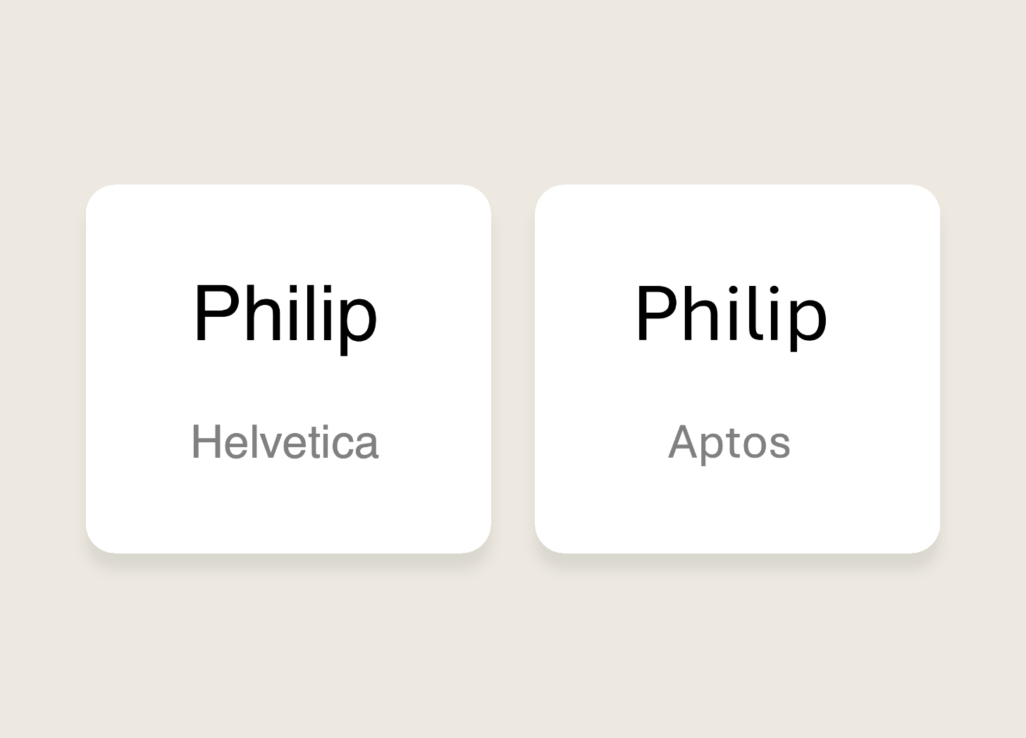
I think the very curvy stem of the lowercase ‘l’ stands out a bit too much. But having said that, it makes checking I’ve spelled my name correctly much easier!
And I think the letter spacing in the default Aptos body style is too wide. At typical sizes for body text my eye finds it harder to clearly pick out the spaces between words. And that’s for both light and dark backgrounds. I much prefer to use Aptos Display for body text. This is technically a misuse of the style because the ‘Display’ variant of a typeface is intended for headings rather than long-form body copy. The letter spacing is more condensed because optically it can simply look ‘too open’ at larger font sizes and can therefore affect readability. Having said all that, I’ll allow myself this one small transgression.
It went up against some strong competitors
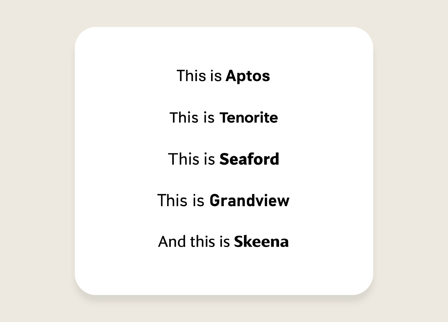
It’s worth noting that, for all its virtues, Aptos didn’t assume its influential position without a fight. Microsoft started tested it against 4 other brand new fonts before announcing it (it was called Bierstadt initially) as the winner around 2 years later.
Looking at its competitors I think it was a sensible choice of winner.
Tenorite echoed the modern qualities of popular fonts like Inter, but this made it indistinctive. Seaford had a bit too much character in its letterforms which would have made it quite polarising, and Grandview had a narrow feel across all its letters that would have limited its versatility.
Last but not least, a part of me had a soft spot for Skeena. With its high stroke contrast, it looked a bit like a retouched version of rotis (❤️). But for that very reason I don’t believe it would have stood the test of time.
In conclusion
The sunsetting of Calibri as the de facto face of Office documents is good news. It’s another feather in the cap of the Microsoft Design team who I think are doing excellent work in challenging people’s conceptions of what Microsoft Office is. And I look forward to seeing what they do next!
My recent compositions
You may remember in my last post that I’m resurrecting a music composition project and am experimenting by posting my latest update here.
I’ve decided to write an a cappella arrangement of Elton John’s song Circle of Life from The Lion King. As is John’s calling card, it has such a juicy chord progression that I had to give it a go. So far I’ve transcribed the melody and chords and made a start at harmonising the other voices. It does not sound great, yet! And I need to find a way for the playback to include the actual lyrics, not just a ‘la’ sound. But it’s progress!