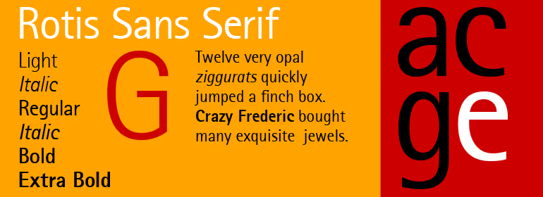
Why I take photos of fonts
Why the rotis font took Europe by storm, and whether it has a chance of doing that again one day.
Every now and again, I’ll be on a walk with someone and in the middle of an important and engaging conversation, when suddenly, I’ll have to say:
“I’m so sorry to stop you. I just need to take a photo of this font I’ve spotted.”
And next thing you know, I'm taking a photo of the branding on some random van while my walking companion wonders whether I’ve finally lost it.
It happened just the other day in fact, here you go!
Um, why?
So, there’s this font. It’s called rotis (yes, it’s officially a lower case ‘r’). And for a few years, it was everywhere.
And then it started disappearing.
And so I’m creating an archive of every place I spot it: The Rotis Font Archive Project.
What’s so special about this font?
Designed in 1988 by Otl Aicher and named after the village where he lived, rotis was designed to break typeface conventions.
Don’t worry, I’m going to do my best to avoid dragging you into the rabbit hole that is typography. It’s fascinating, but I’ll stop myself.
Ok, here we go.
Traditionally, one way to categorise a font is according to whether it’s a serif or sans serif.
Serif fonts look more ‘old-fashioned’ because the terminals of each letterform are ornamented with little strokes. Think of your old friends Times New Roman or Garamond.
Sans-serif fonts (i.e. without-serifs), are more ‘modern’ looking because of their simple, blocky letterforms. Think of the famous Helvetica or the similar but vastly less aesthetically pleasing Arial.
So we have serif and sans-serif fonts, and the world is at peace.
Then along comes rotis.
Rotis was one of the first typefaces to break the mould by being both. It had both a Sans Serif and a Serif style. And if neither quite took your fancy. It even offered styles that sat in-between; Semi Sans and Semi Serif!
Because it’s common for serifs to be paired with sans-serifs, for titles and text or vice versa, rotis suddenly let you create this same pairing with the same typeface! Opinions will differ, but I personally think the results can be effective, achieving variety while retaining a sense of cohesion. It’s also cheaper to buy one font rather than two.

And so, its high readability at various sizes, and its unusually diverse family of styles, meant it took Europe by storm in the 1990s and early 2000s.
Inevitably however, the cycles of graphic design fashion keep turning. Rotis started falling out of fashion in the late 2000s and early 2010s.
Today, partly because of how ubiquitous it was when I was growing up, it holds a special place in my heart. I remember seeing it everywhere in books and on posters as a kid. I even have a couple of old Rough Guides books from the late 90s that are set in rotis, and I think they’re still beautiful.
But it could come back, right?
Rotis’ distinctiveness is a double-edged sword. In a world that is increasingly “de-branding” and moving away from wordmarks, it’s not as malleable as simpler fonts. It’s hard to see how it might become fashionable again.
Having said this, rotis is a young font. For comparison, the Nike Membership logo combines the Futura sans-serif font with the Palatino serif font. Both these fonts are over 70 years old. And while some fonts are definitely timeless, I don’t think any fonts sit on the other extreme end of that scale.
Which is to say, even though rotis practically screams of the 90s, I don’t think its relevance is confined to that period.
So, yes, I personally hope that rotis, just like its sibling fonts, succeeds in weaving in and out of fashion.
Until then, I’ll keep taking photos!
Sources (image sources are linked in captions)


