

Why the Ribbon user interface pattern in Microsoft Word is an unsung hero of innovative design: Part 1
How familiarity needs to be balanced with discoverability to keep commercialised software competitive.

In this newsletter: Why did the UI in Microsoft Word work so well but then start creaking? How would it continue to serve its users while introducing new features to remain competitive?
I still have a copy of the first Microsoft Word document I ever made.
It was some school homework about the story of Pheidippides, whose 150-mile run inspired the modern day marathon race.
It was fun to write, but I was finding it hard to read what I’d written because the onscreen text was so small. Searching for a way to make the text appear bigger, I found the font size picker and went straight for 72pt. Bossed it.
Of course, the surprise came when I found my printer spewing sheet after sheet of A4 with no more than a word or two printed on each.
And so, on that fateful day, I learned the difference between font size and page zoom. And I’ve been somewhat obsessed with Word ever since.
I’ve seen it go through some big changes. Arguably the biggest was the overhaul of the UI in Word 2007 to introduce the Ribbon.
But we’re getting ahead of ourselves. In this Part 1, I’ll take you on a trip down memory lane to explain why the Ribbon was even necessary. Then, in Part 2, I’ll go all in to try and convince you why it was such a great solution.
Let’s go!
In the beginning…
…or rather, in 1989, there was a brand new, simple little application called Microsoft Word. Even today, its User Interface (UI) looks very unassuming. Just a big old empty page, a menu bar at the top housing all the commands, and a toolbar of commonly-used commands underneath for quick access.
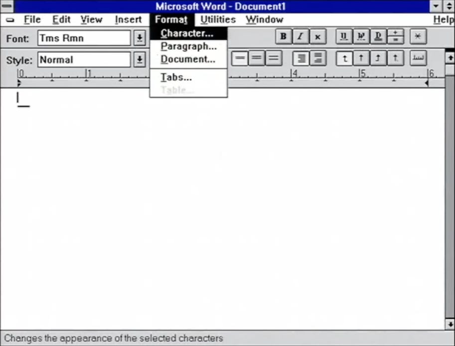
This menu bar UI pattern worked well because each menu had very few options. In fact, by design, each menu had no more than seven items, which according to Miller’s Law is about as many items as someone can keep track of in working memory.
However, as Word matured through the years, problems began to appear.
What could possibly go wrong?
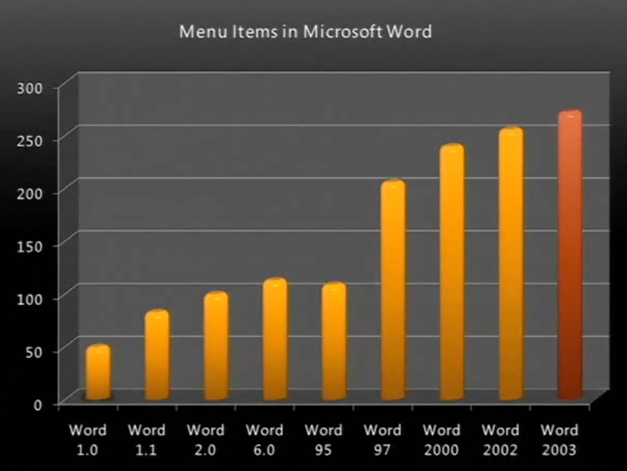
While 1989’s Word 1.0 had just under 50 menu items, 3 years later Word 2.0 had double that number. And then 6 years later Word 97 had double that number again!
While you could jump to the argument that this was a classic case of software bloat, the real issue wasn’t so much that Word had too many features, but rather that the structure by which those features were presented to users was starting to burst at the seams.
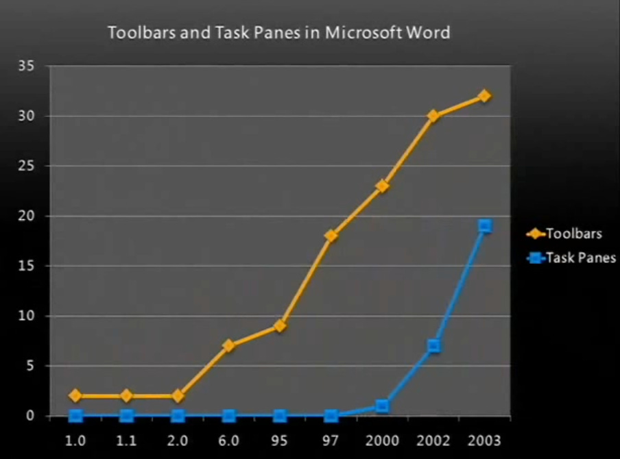
How? In the same 8-year period between Word 1.0 and 97, the number of toolbars grew by almost 10x and was still growing. Another symptom was that the number of task panes (these are different to toolbars as they are made of panes of commands that slide in from the left or right) started growing exponentially immediately after they were introduced in Word 2000.
This was clearly not sustainable. While Microsoft needed to keep developing new features for their software to remain competitive, implementing these features in a non-scalable way would risk overwhelming and driving away their users. What were they to do?
How do you solve a problem like new features?
Let’s step back for a moment. What is a user’s goal when using Word?
Whether they’re making a poster or a complex report running into hundreds of pages, the underlying need is the same: to produce good enough quality work in as little time as possible.
This goal isn’t unique to Word of course. For any task you’re trying to complete, you’ll likely have a set of tools with which you’re familiar. Do that task frequently enough, and you’ll have built so much ‘muscle memory’ with those tools that you’ll know their powers and limitations inside out. That will enable you to create high quality results, fast. And you’ll start to hear others ask ‘Wait, how did you do that so quickly?”
The downside of this familiarity is that you might be unaware of or reticent to try new tools that might give you a step change in quality and speed. But notice the key word here; “change”. Change is uncomfortable. It’s unknown.
So here’s Microsoft, with a growing base of users who sit in front of Word almost every day at work and increasingly at home. They’re perfectly familiar with the tool as it is and don’t need it to change beyond that, thank you very much.
You can’t pretend your software won’t change
Word had to change to remain competitive in a maturing computing industry. Like any commercialised software, it had to have a product strategy.
And when implementing new features as part of this product strategy, a balance had to be struck between:
Familiarity: allowing users to still quickly access the tools they use most, and to continue using the mental models they’ve developed to understand how Word works, and
Discoverability: giving users the opportunity to uncover new features that could help them deliver higher quality work more quickly.
In the 1990s, Word leaned more towards the discoverability side of this equation, with its ever-growing menus and toolbars as mentioned above.
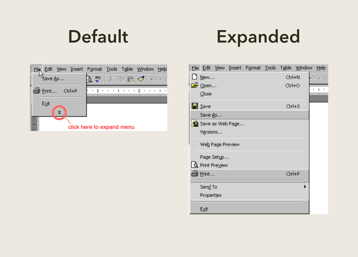
Then in the early 2000s, they tried to rebalance this equation by leaning more towards the familiarity side. How? You might remember seeing little chevrons at the bottom of menus. When you clicked on these chevrons, more menu items would magically appear. The hidden commands would sometimes be chosen at random, but most of the time it was driven by usage data around which commands users clicked least frequently.
So how did Microsoft rebalance familiarity with discoverability?
You guessed it; the Ribbon started to take shape. In Part 2, we’ll see why the Ribbon UI pattern worked so well and how it’s evolving in the future.
UPDATE: Head over to Part 2!

Sources