

Why the Ribbon user interface pattern in Microsoft Word is an unsung hero of innovative design: Part 2
The Ribbon introduces itself, works incredibly well, but then finds itself needing to adapt in a changing technological landscape

In this newsletter: What is the ‘Ribbon’? Why did it work so well in balancing user familiarity with feature discoverability? And how might it change in future?
Be sure to check out Part 1 first:

Quick thing before we dive in: some people have told me that they can’t see the images in these emails, which is a terrible shame. If you find yourself in this predicament, check whether your email client (e.g. Microsoft Outlook) is displaying a message saying something along the lines of “Click here to download pictures. To help protect your privacy…”. Clicking that message or a nearby button ought to add this newsletter’s email address (designphilosophy@substack.com) to your trusted sender list, and the images will appear now and in future. Nice!
And while you’re clicking on buttons, here’s another to click on if you haven’t already 😊
In Part 1, we saw how Microsoft Word’s feature set grew rapidly in the period between its humble beginnings at the end of the 1980s and its maturity into a industry workhorse by the early 2000s.
We also saw how — much like a Brutalist building — the User Interface (UI) patterns that served it so well in its early days were not aging terribly well (that felt like a low blow…don’t worry, I love Brutalism).
We closed with the question of how Microsoft might rebalance its users’ familiarity with the discoverability of new features.
So here we are! Their solution was the introduction of the Ribbon.
What’s this ‘Ribbon’ thing?
The Ribbon is a general term for a UI pattern that is made up of controls (buttons, text fields, etc.) arranged in a short height grid across the top of an application, organised into tabbed sections.
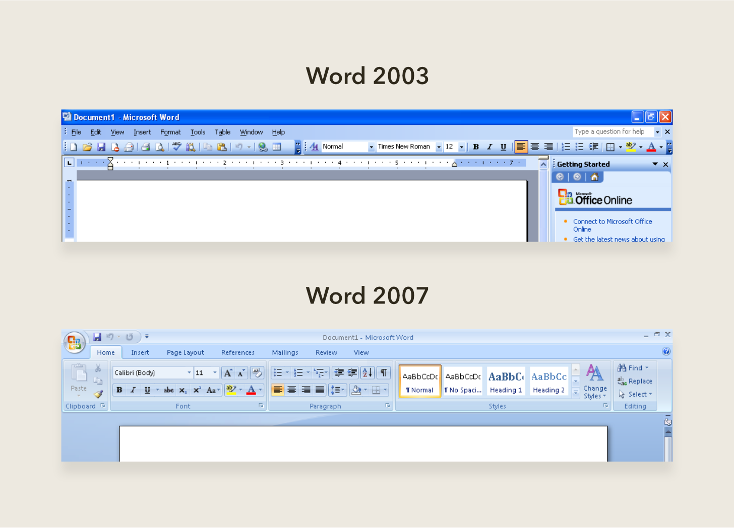
You’ll find various incarnations of the Ribbon in software from all kinds of industries, from engineering (e.g. AutoCAD and SolidWorks) to music production (e.g. Sibelius and MuseScore). But you probably saw it for the very first time in Word 2007. You can see how big a change it was if you were used to an earlier version like Word 2003.
Why did it work so well?
Let’s look at an example that neatly summarises how the Ribbon balanced both familiarity and discoverability.
Let’s say you were writing a document and decided to add a picture.
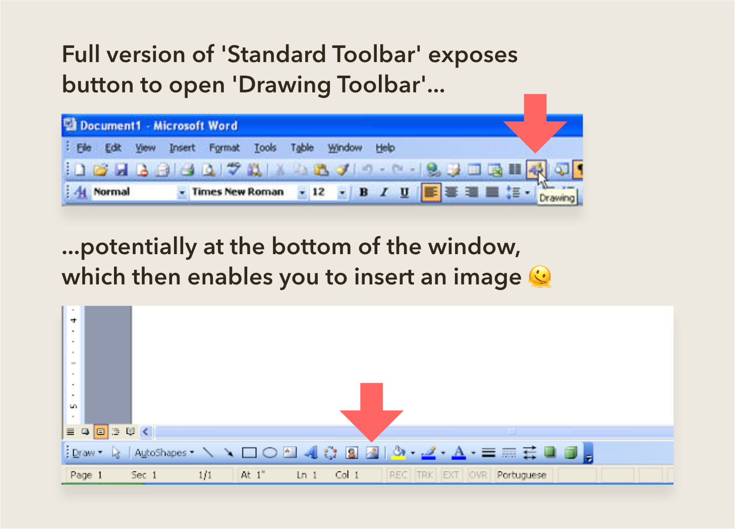
As we saw in Part 1, if you were using a pre-Ribbon version of Word, you would have had to rely on the bloating Insert menu. Or, if you were brave enough to rummage through the toolbars for the same command, you might have found that you needed to jump through a few hoops to find the command, as shown below.
The Ribbon’s success was in introducing a single, repeatable route for finding this and any other command:
First, decide under which of the tabs the command you’re looking for is likely to be.
Second, find the button. If it’s a commonly-used command, it’ll show up as a larger button compared to the others, including both an icon and text.
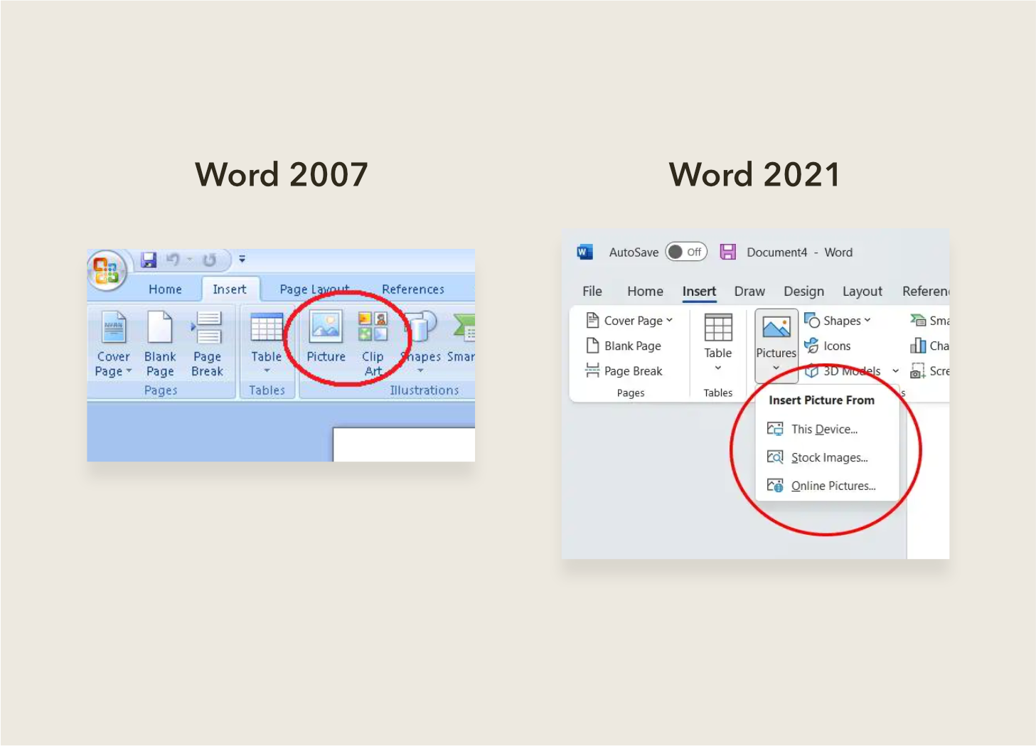
And to help users transition into the Ribbon, the names of the commands were kept largely the same as earlier versions of Word. In our example, you would likely have decided that Insert was the most promising tab to click on, after which you would have found the Picture button close by.
Even better, this Picture command could remain in this familiar place and then be augmented with new features over time for the user to discover. To this day, the Picture button hasn’t moved and has transformed into a dropdown with many other options for inserting an image from sources other than your computer.
So will the Ribbon work forever?
A lot has changed in the 16 years since the Ribbon’s introduction.
Users are increasingly looking for tools that help them stay focussed on the core task, eschewing those that distract with lots of extraneous bells and whistles. Microsoft themselves have stated that their new priority is developing “Experiences built for focus”. The Ribbon, with its patisserie-esque display of colourful buttons, doesn’t really support that.
People are also doing more of their work on small screen devices like tablets and smartphones, to which the Ribbon doesn’t translate well owing to the amount of space it takes up relative to the content.
So what happens to the Ribbon?
As more organisations pursue a strategy of providing a consistent look and feel across their mobile and desktop software, designers will look to implement UI patterns that work equally well across these platforms.
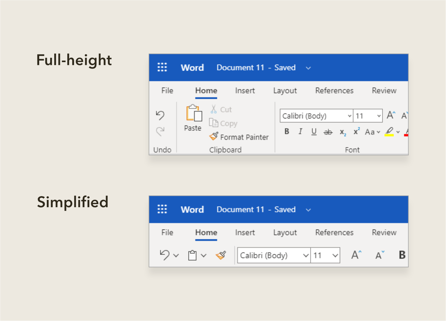
So, where the Ribbon is already present, you’ll likely find it shrinking into a more diminutive form. For example, the web-based version of Word allows you to collapse the ribbon into a single row of commonly-used commands. Also, to reduce distractions, you can now enter a special ‘Focus’ mode in Word that hides the Ribbon and other UI elements, leaving just your content.
Teasers for future versions of Word show the Ribbon reduced even further to something that feels similar to how software like Notion has approached UI design. This younger application has almost no permanently visible UI at all, instead displaying a popover of insertable content when the user types a forward slash. Formatting commands, for example for bold or italic text, also appear only in popovers.
So to conclude
The Ribbon was a fantastic solution to a problem that frustrated users and restricted Word’s ability to grow as a product.
But with the recent proliferation of mobile devices, the Ribbon isn’t well-suited to delivering a consistent cross-platform user experience.
What remains true however is the need to balance familiarity and discoverability in software, and I’m excited to see what UI patterns this manifests in future.
References (image sources are linked in captions)