


A journey map of exits and dead ends
In Part 23 of my project to build the biggest online archive of the Rotis font, I step back to see whether the website is structured to support positive user journeys

When I started rotisarchive.com, I had a picture in my mind for how it would be structured.
But that was more of a taxonomy, (a classification of information) rather than an information architecture (a navigable structure of information). The core of the website was a set of similar-looking pages, grouping records by industry and type.
After all, the original purpose of this website was simply to store a big repository of records on the rotis font. I hadn’t thought as deeply about the journey a user might take through the website.
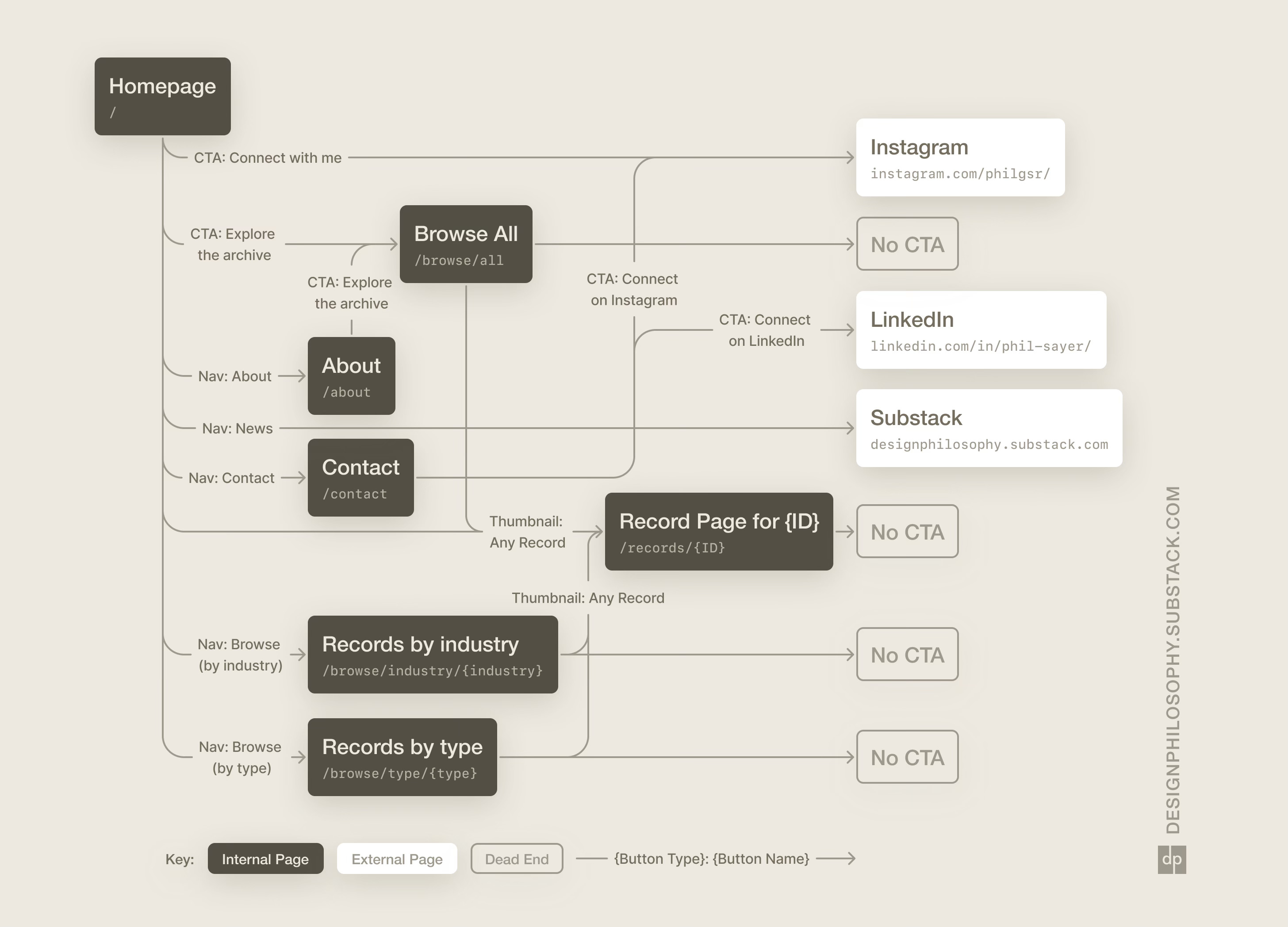
Now felt like the right time to take a step back and look at the website as a whole. What paths can a visitor take? Where does their journey start and end? What journeys do we want to guide them through?
I put together a high-level ‘journey map’ with boxes for each webpage, joined up by arrows. Each arrow was labeled to show the button clicked and the type of button.
Button types were labelled as:
Navigation (“Nav”): buttons in the navigation bar at the top of each page
Call-to-actions (“CTA”): buttons displayed within the main page content
Thumbnails: clickable images of each record
The boxes were colour coded as:
Internal Pages: paths under the rotisarchive.com domain
External Pages: any website outside of the rotisarchive.com domain
Dead Ends: paths under the rotisarchive.com domain that didn’t guide the user anywhere else
Having this map in hand let me ask questions like:
“What would be the most common entry point into the website? Is it necessarily the homepage? What story should that landing page tell?”
“What unnecessary clicks and pages exist that distract from the storytelling?”
“Where are the journey dead ends (marked by the “No CTA” boxes) and where is the user exiting because a link takes them away from the website?”
I’ll be exploring these questions and ways to resolve them in future posts 😄
Have a good week!
A good way to look at it. I don't think it's necessary a bad thing to not have a CTA at the bottom of every page. The record pages themselves have content to consume and options to continue to the next category/item/industry so that is basically the CTA for them.
Where I see potential is the narrative, how can I (the visitor) understand why you (the author) cares about this font and make me care about it a little bit more.