


Why is music notation software so hard to design?
Who knew that creating some sheets of black and white printed paper would be fraught with challenges

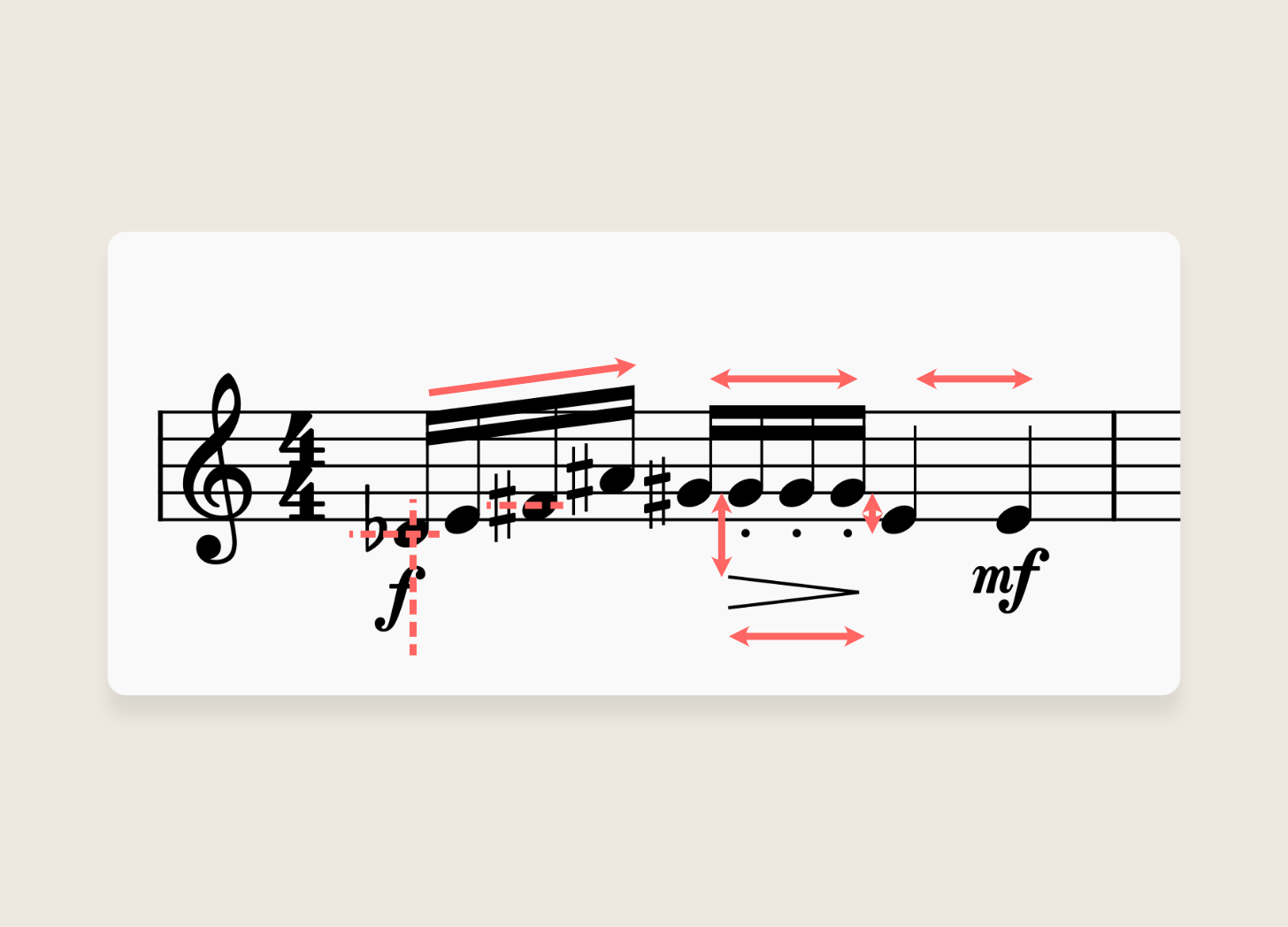
Sheet music can look deceptively simple.
And yet, designing the music notation software that creates that sheet music is very hard.
But why? Isn’t it just a bunch of static monochrome vector shapes stuck onto a page of A4? On the scale of creative endeavours, it’s hardly a CGI-dense blockbuster film.
However, today I’d like to walk through three reasons why it’s so hard. Not uniquely hard, but at least as hard as it is to design other creative software. Even if you’re not involved in music, or you can’t read sheet music, this post is still for you!
I’m going to be drawing lessons from Martin Keary who runs the Tantacrul YouTube channel of which I’m a big fan. He’s both a composer and software designer and as VP of Product at Muse Group (who make the MuseScore notation software I often use) his channel is a fantastic resource for anyone who has a foot in either or both the music and design worlds.
1. Music notation is steeped in hundreds of years of rules, best practices, and exceptions
Pieces of music range from solo piano to large scale orchestral works and there are hundreds of instruments that all need to be representable through music notation.
There are also a near-infinite number of combinations of ‘elements’ like notes, symbols, articulations, and ornaments which all have precise best practices for how to be positioned relative to each other.
Notation software needs to provide the right balance of guardrails to help users adhere to best practices when it comes to layout, while also providing the flexibility to accommodate personal and piece-specific preferences.
For example, in orchestral music, the ‘parts’ (i.e. the lines of music) for the brass section (trumpets, trombones, etc.) are typically placed above the parts for the string section (violins, violas, etc.). But the software needs to accommodate pieces, composers, or performers prefer to order the parts differently.
It also needs to find the right balance between giving the user shortcuts to creating a well-laid-out score, while not constraining them with these same rules too early on in the creative process.
2. Exploration and refinement isn’t a linear process
Like any creative process, composing music has phases of exploration and then refinement that don’t necessarily happen linearly.
There’s an exploratory phase (”composing”) for which the software needs to allow the user to construct and revise complex sequences of notes with little negative friction.
And then there’s the refinement phase (”engraving”) which is all about tidying up the layout for ease of legibility.

While each of these phases puts the user in a different mode of thinking, they will still move back and forth between them.
For example, it may be during the engraving phase that a user realises that the cello is getting louder at an inappropriate section of the music, and needs to go back to composing mode to completely change the dynamics.
3. A score is a living, breathing embodiment of its stakeholders’ needs
A score documents a piece of music. But unlike, say, a book, it isn’t static. It doesn’t have one immutable version of itself.
Instead, a score is there to tell musicians what to play. And as such, it has multiple stakeholders. For example, if writing a short piece for solo piano, you have just the pianist to worry about. If however you’re writing Handel’s Messiah, often performed by large scale groups in London’s Royal Albert Hall, you need to think about the needs of hundreds of orchestra and choir members.
And so, all notation software needs to allow users to create not one, but potentially tens of scores of the exact same piece of music to suit the needs of each musician.
For example, a conductor will want the parts for all the instruments printed in their score, but a violinist will likely want just their section printed in theirs.

Notation software therefore needs to be smart about how it handles the data that represents the music, ensuring that it can be rearranged and reformatted without destroying the precise positional relationships between the elements.
If it does this badly, the user will be forced to spend hours painstakingly nudging elements around to get each score looking right.
In closing
I’d recommend watching the videos on the Tantacrul channel in full, and I’ve linked below all those that informed this post.
As a closing thought, here are his suggestions for how to think about new software that I found insightful:
When a new version of a creative app is released, my questions are nearly always “What were the compromises here? What didn’t work out? What were the emergencies and changes of plan?” And when it’s particularly successful, what I want to know is “How is it done? What magic combination of organisation, skill, and good luck made this possible?”
Tantacrul (source)
As this is my last post of 2023, I wish you a wonderful break and a Happy New Year!
Sources (image sources are linked in captions)