


Three key differences between Figma and Framer when building your designs
In Part 18 of my project to build the biggest online archive of the Rotis font, I show you how I've translated the Framer website back to a Figma prototype


To give me more room for experimentation, I decided in my last post to translate the archive from the website building tool Framer back into the design tool Figma.
So far, I’ve rebuilt the homepage in Figma, including the nav bar, record thumbnails, colour variables and text styles.
For all their similarities, I discovered 3 significant differences between how these two tools work that are worth knowing about.
Difference 1: How components are organised
Figma lets you create components out of almost anything on the canvas, and place them almost anywhere. You can even organise them into ‘sections’. Framer on the other hand is strict about separating components into separate canvases.
Given how robust components need to be for a website to work properly, I understand Framer’s approach. However, it does slow down the process of switching between components.

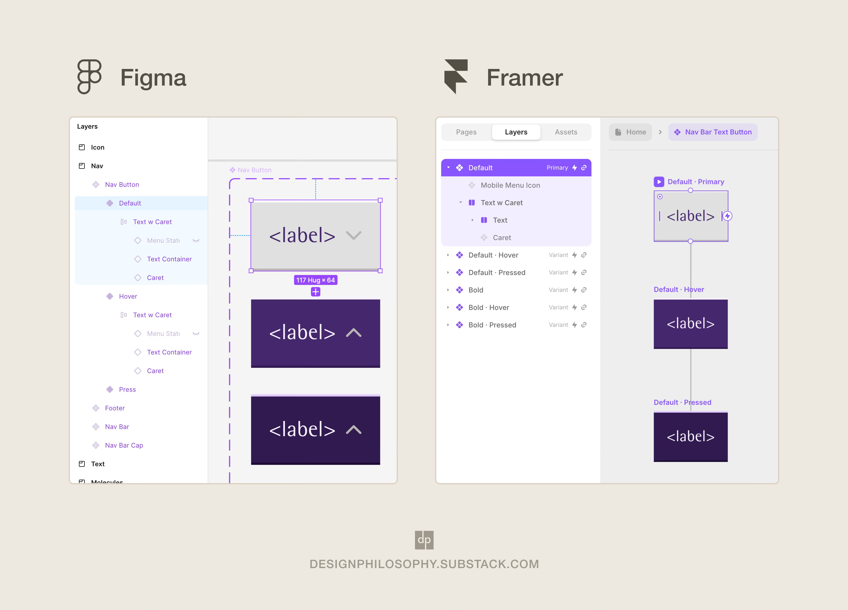
Difference 2: Inheritance between states
Let’s say we’re building the nav bar, complete with Default, Hover, and Pressed states.
In Figma, Component ‘Variants’ are a great tool to use. But fundamentally, Figma doesn’t regard these Variants as representing specific states. Framer also uses ‘Variants’ to represent different states. But because of the robustness needed, it again is strict about what state each Variant represents.
At the same time, Framer cascades properties from the ‘Primary’ Variant to the secondary Variants. This makes some actions quicker in Framer, such as specifying whether a dropdown caret is visible by default. Whereas in Figma, it takes more manual work to link up the carets across variants to achieve the same goal.
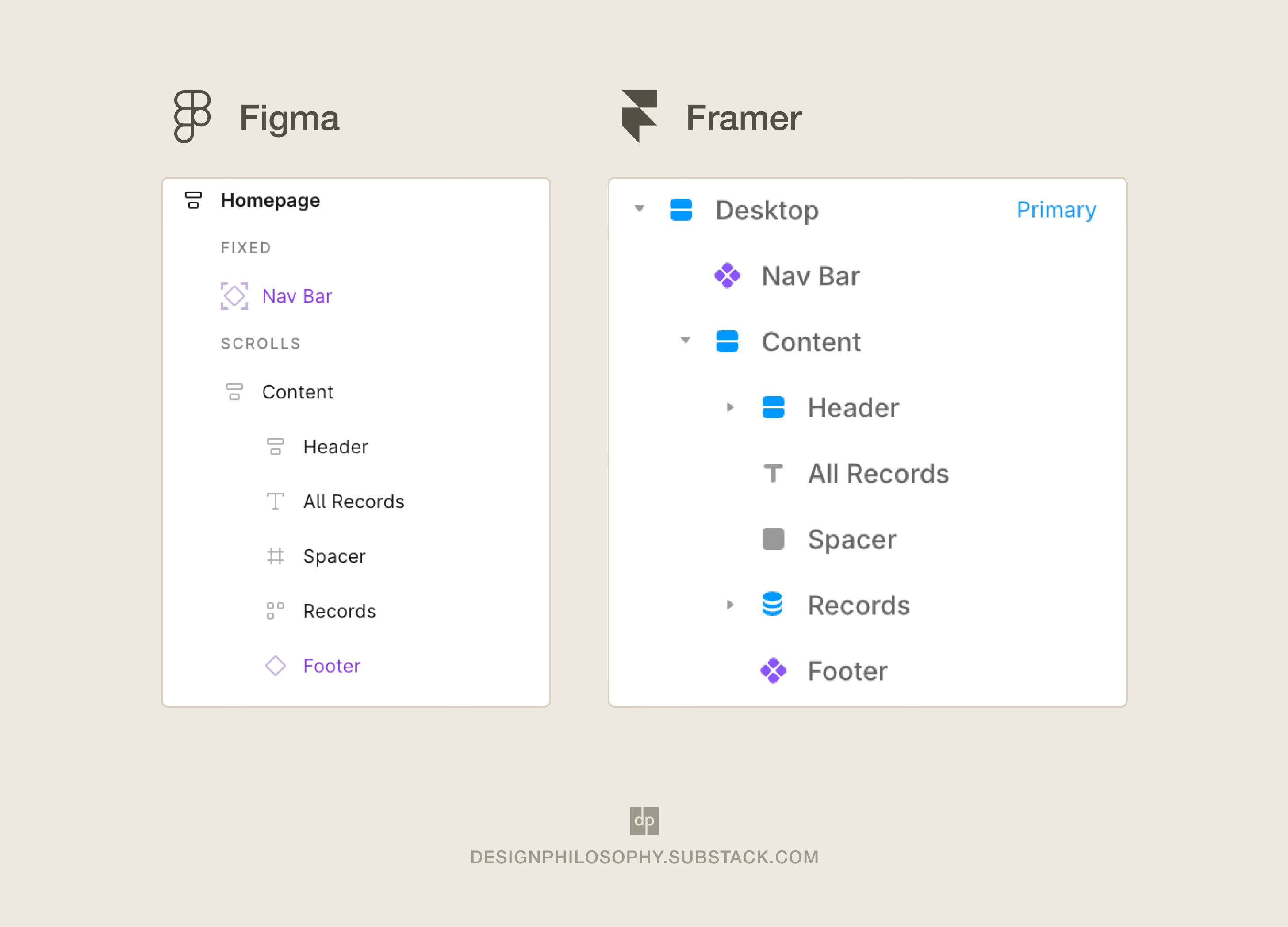
Difference 3: Fixed layers within Auto Layouts
The nav bar needs to ‘stick’ to the top of the window when scrolling down the page, and this is configured differently in Figma and Framer.
Both tools let you slot the nav bar into an Auto Layout (or ‘Frame’ as Framer calls them) and mark it as a ‘Fixed’ element on the page. But Figma makes this difference clearer by splitting the layers in the panel under ‘FIXED’ or ‘SCROLLS’ subsections. To me, this makes it clearer how that layer behaves.
The result
Despite these differences, I’ve pleased I could build my Framer website homepage in Figma pixel for pixel.
Now it’s time to fix that mobile navigation, and look at a homepage redesign! 👀
Have a lovely week 🐝
I haven't used Framer properly for a project so it's good to know how it differs. I will have to create a project in there soon so I can try it out and compare the experience to Figma and Webflow, as it's right in the middle with its interface design and functionality.
Good luck with designing it in Figma!