


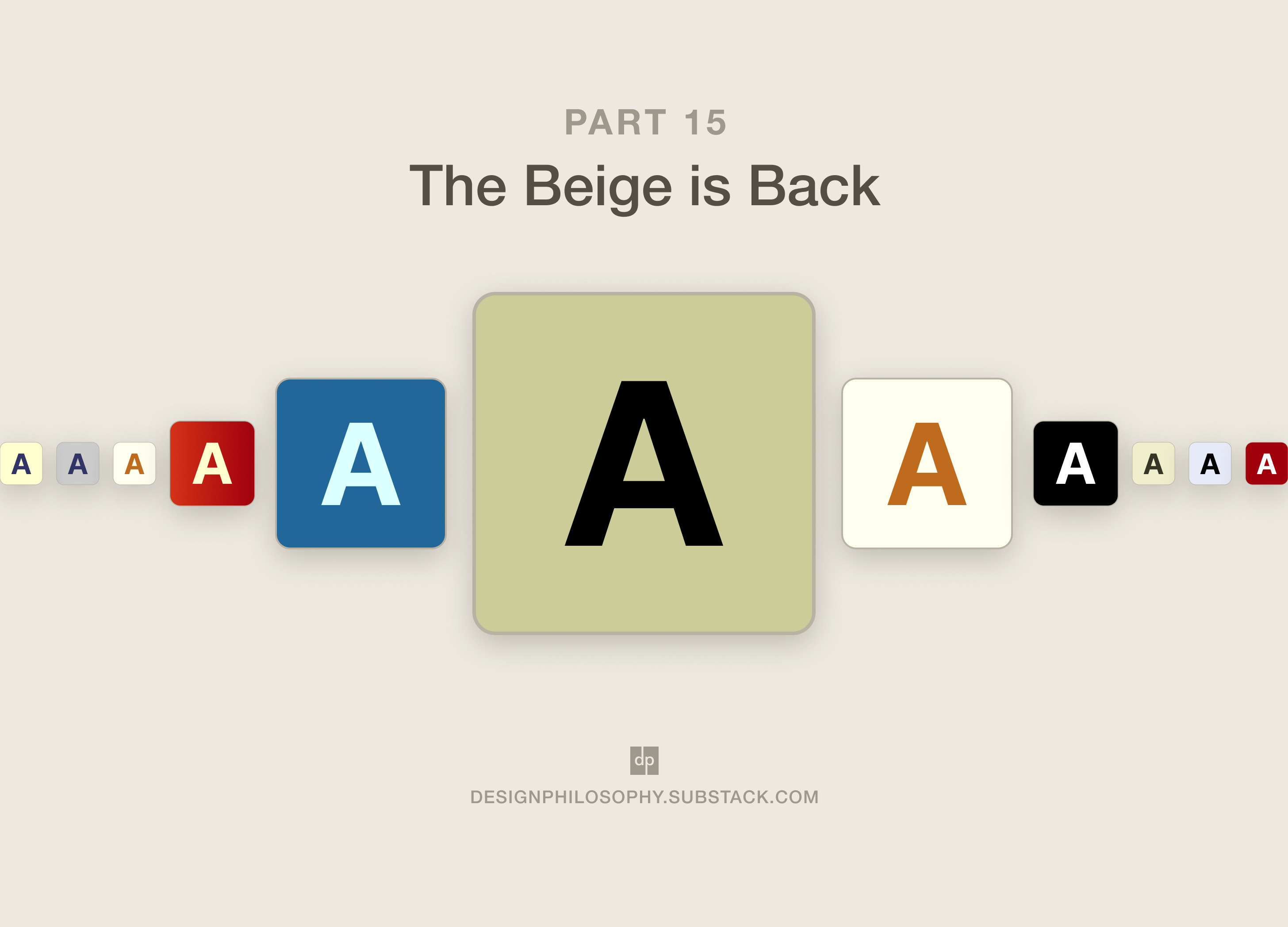
The Beige is Back
Part 15 in my series on building an online archive to celebrate the Rotis font

My focus for the last few weeks has been building out the footprint of rotisarchive.com, adding more records and making them more browsable.
While there are plenty more features I want to develop, this week felt like the right time to work on the creative direction of the site.
My goal remains to blend visual themes and motifs from the 1990s and early 2000s with modern web design.
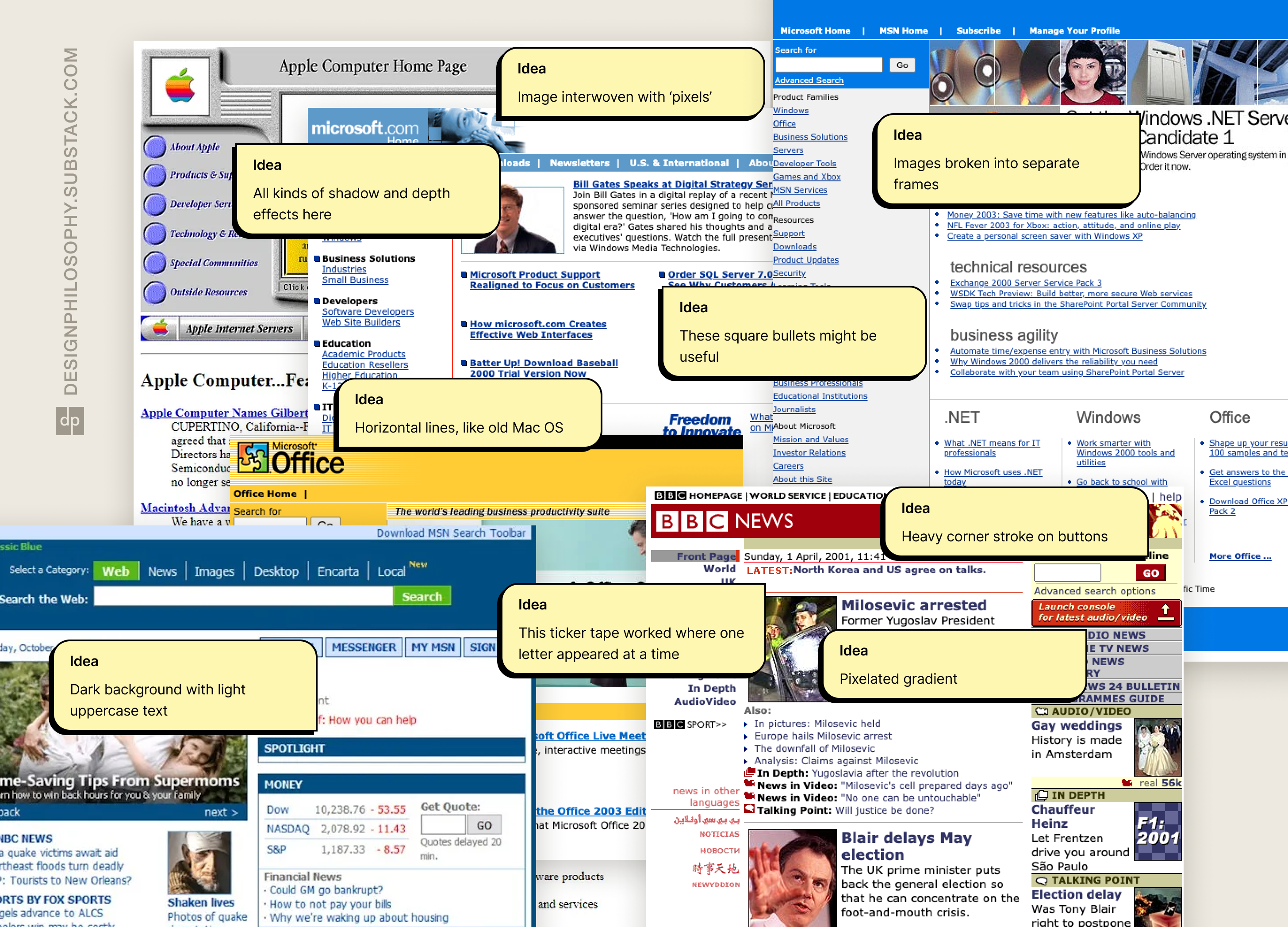
My plan was to build on earlier research on the general look and feel of this period, this time narrowing down on websites. And even more specifically, buttons!
How did I do it?
I popped on some headphones, set my music library to shuffle, and started surfing the wonderful resource that is the Wayback Machine.
If you weren’t already aware, the Wayback Machine is an initiative run by the Internet Archive. It’s been saving snapshots of millions of websites for over 20 years, making it an amazing resource for understanding how web design has evolved.
What did I learn?
Turns out buttons weren’t terribly interesting until advanced styling through Cascading Style Sheets (CSS) technology became possible in the second half of the 2000s. Before then, most sites settled with the classic blue underlined links, basic coloured text, or native chunky grey buttons. More snazzy formatting could only be accomplished by creating the button in photoshop and then sticking it on the website as an image.
So rather than capture just the button styles, I pivoted to capture the general colour scheme of the websites I saved; the idea being to blend those into the button designs I could create in Framer.
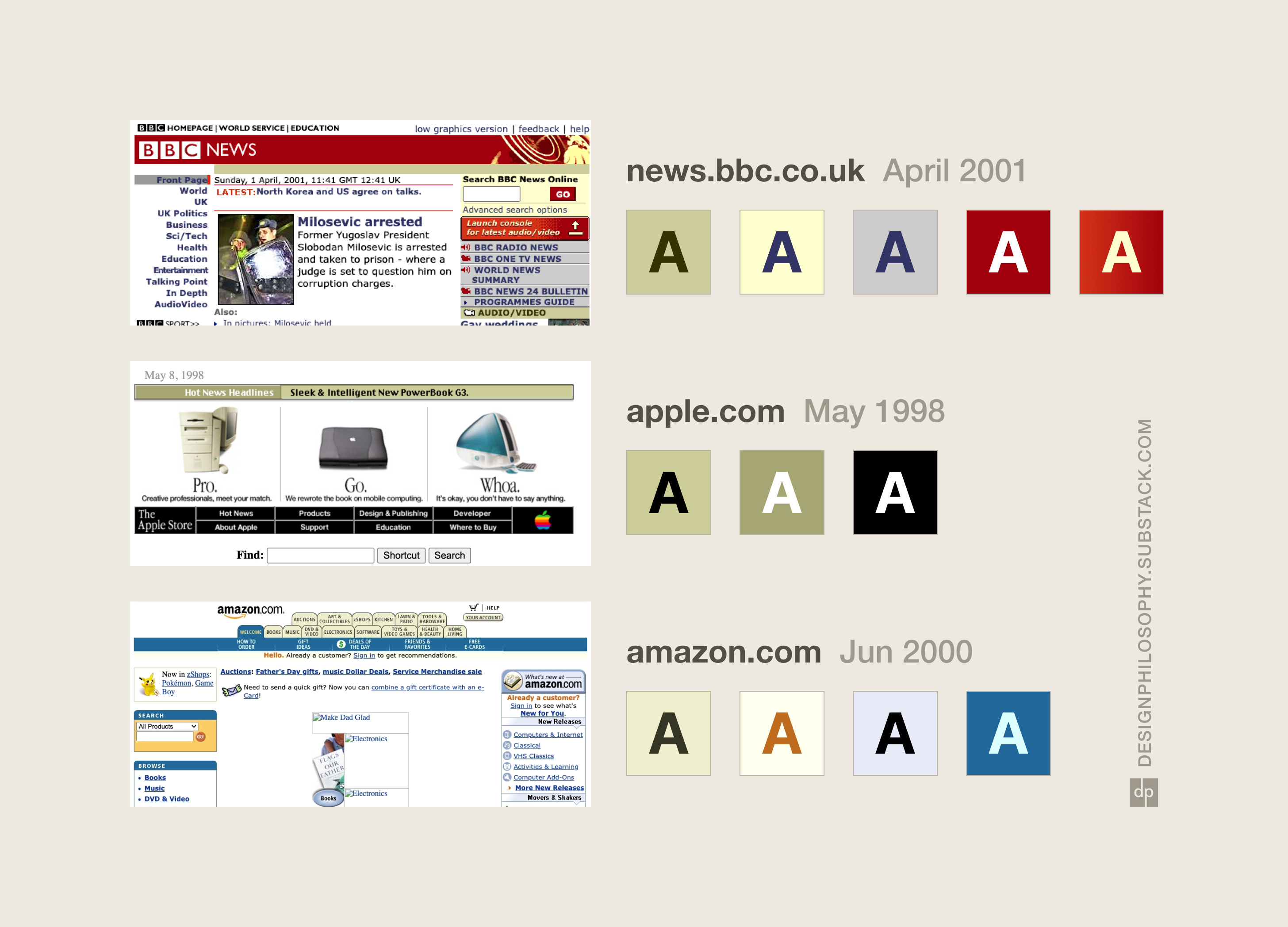
Some colours kept popping up again and again:
Beige
Cream
Grey
What a surprise.
But I think it gives me an interesting foundation to riff on. In the coming weeks, I’ll build on this and start prototyping some buttons, which I’m actually really looking forward to.
Until then, have a lovely week 🌞
This was a great dive into the design trends of the time period. Reading the notes you took really helped me breakdown how to describe the elements that made a website feel like 90s/early 2000s.
It would be great to experiment with these elements/patterns to see how you can make pay homage to the era without the website itself feeling outdated. Looking forward to the outputs from your prototyping sessions.