Here's why Rotis Archive won't look like your typical online archive
Part 3 in my series on building an online archive to celebrate the Rotis font
👉 If you’re new to this series, I suggest making yourself a cup of tea and exploring the story from the beginning:
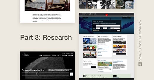
Over the last couple of weeks, I’ve been researching and mood-boarding the structure as well as look and feel of the Rotis Archive website.
In the process, here are three things I’ve discovered:
1) It’s very easy for archiving websites to default to a ‘classical’ look
Many websites with archive collections use a style that evokes antiquity, perhaps to support the idea that they are the arbiters of history, or that they have a long history of collecting artefacts of importance. Or they could just be reinforcing the message that “This tells you what kind of old stuff you’ll find here”.
My aim is for Rotis Archive to avoid this kind of ‘classical’ style, partly because the font itself is less than 40 years old, and partly because the message I want the website to reinforce is “This font might be out of fashion, but it’ll continue to impact design for years to come”.
2) It’s also very easy to default to a minimalist look
It’s tempting to follow the same minimalist and monochrome approach that many websites follow when they are aiming to evoke sophistication. That often means black/grey text on pure white backgrounds, or vice versa.
I want to avoid this partly because I want to challenge myself to come up with something better, and partly because a screen of pure white is straining to the eyes.
I’m avoiding blues for a similar reason; it’s an inoffensive option that portrays professionalism and trust. But just for the sake of it, I want to challenge myself to explore a different colour scheme.

3) Storytelling and speed are key to keeping visitors engaged
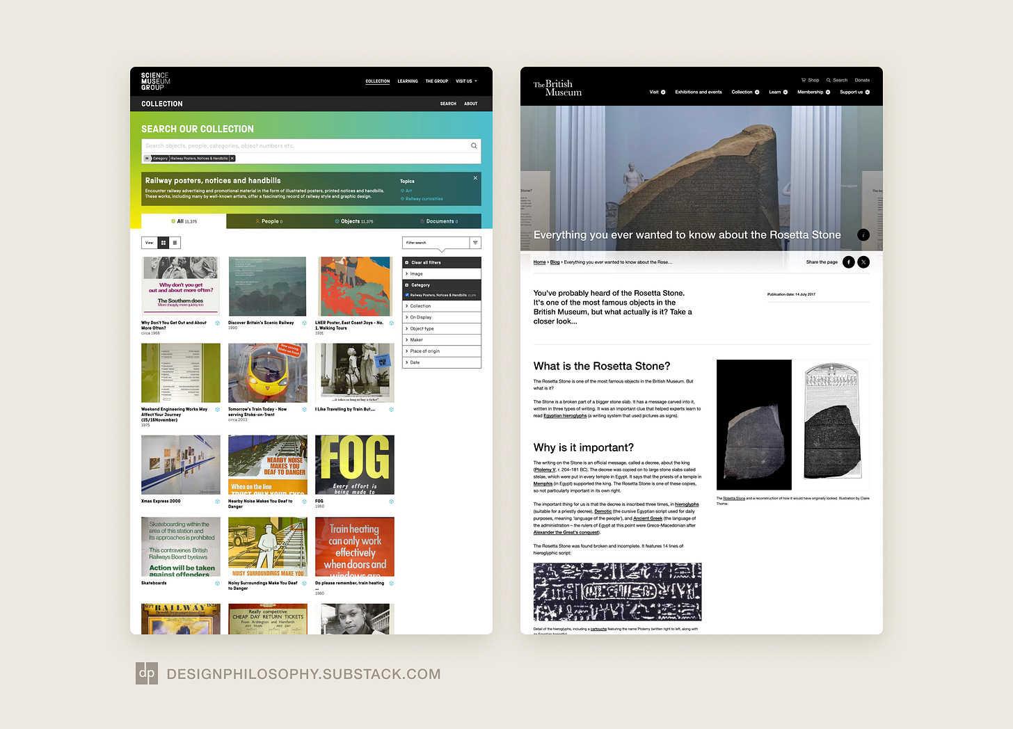
Some websites present their collections like databases, with individual records for each artefact. I had been considering a similar approach for Rotis Archive.
But in my research I discovered that the websites that kept me engaged shared a couple of characteristics:
They showed me not just individual visuals that had the ‘wow’ factor, but also told me why those visuals were important.
They allowed me to move between visuals quickly.
Databases of unordered artefacts might be better suited to visitors with specific searches to make. But my goal is to immerse visitors in not just the artefacts but the story of why they’re important too.

Wrapping up
As I continue working on the Rotis Archive, I hope that by avoiding classical clichés, challenging minimalist trends, and focusing on storytelling, I can create a resource that inspires and educates visitors.
Have you seen some great online archives that I should know about? Please let me know! Leave a comment or send me a message 😄
👉 The story continues in Part 4:


Captivating and wish to know more.