Designing a To-dos aggregator for Notion
A proposed new feature to help keep track of and manage those little To-do lists
This post is about a little high-speed design challenge I’ve given myself to come up with a solution to something that’s been bugging me in Notion.
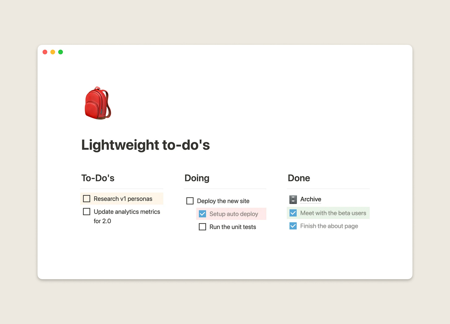
It’s about the ‘To-do list’ block type.
It’s really great for throwing tasks on a page rather than entering them diligently into a more rigid task list database.

But unless I attach a due date reminder to those to-dos, I find myself forgetting about them. I write them down, move on to another page, and it’s “out of sight; out of mind.” 😞
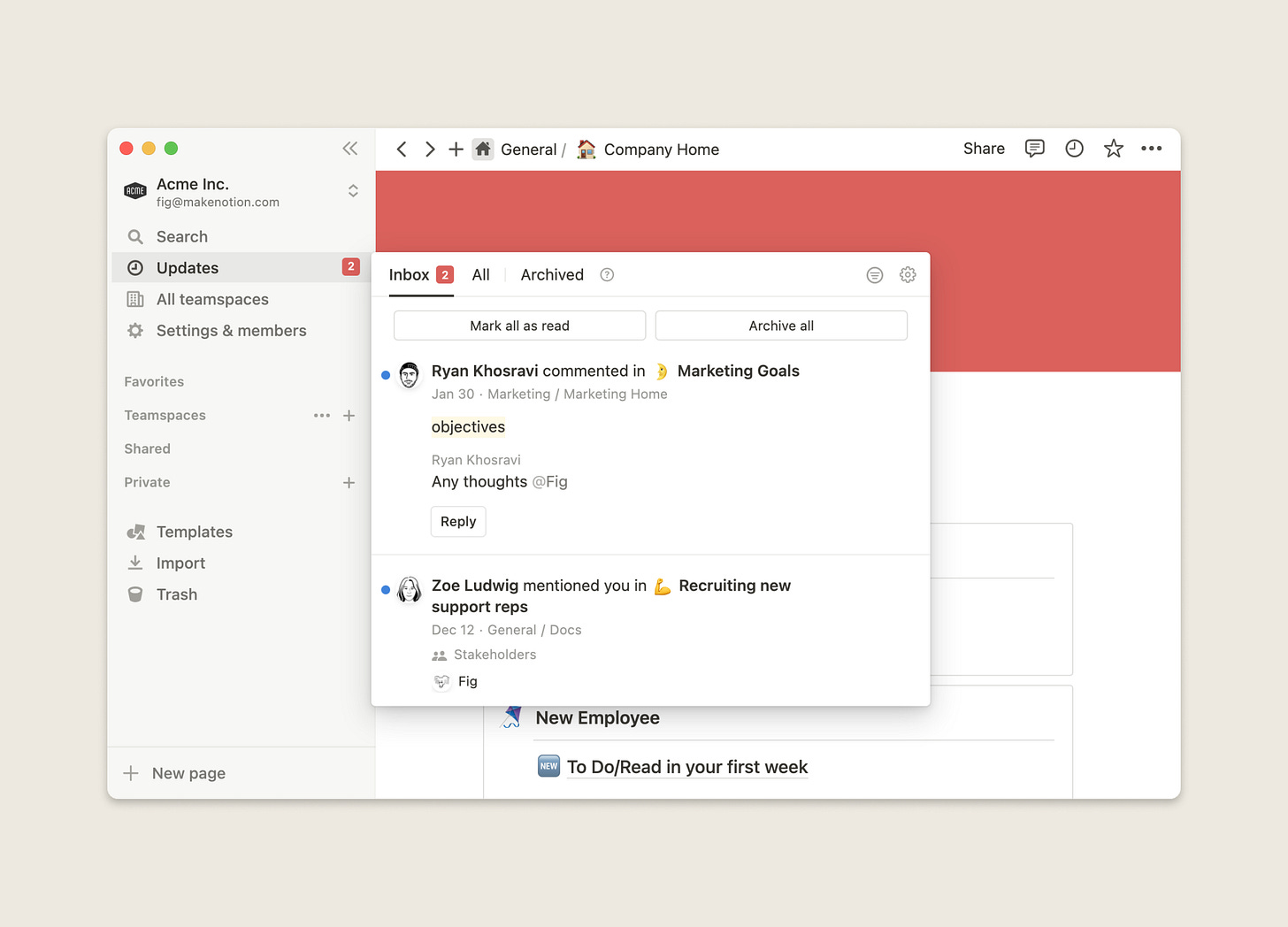
And while Notion does have a handy ‘Updates’ popover that surfaces a reminder when the due date is reached, it does risk creating an unmanageable inbox of unaddressed reminders. It also doesn’t give you any warning that the reminder is coming up, leaving you to scramble to get that thing done on the day it’s due, or have it languish in your Updates inbox for perpetuity.

So I gave myself a morning to design a potential solution from scratch in Figma.
Here’s what I came up with
Like my earlier exploration of a persistent table of contents, this proposed feature lives in the right-hand fly-out panel and is accessed via a new checkbox icon.
By default, it’ll show you the ‘This page’ view which shows the to-dos on just the page you’re on.
And you can toggle over to the ‘Workspace’ view to view to-dos across your whole workspace.
Why I think it addresses the problem:
To-dos are sorted by ‘Due date’ by default, and the drop-down chip allows for alternative sorts. So you always see your most pressing to-dos first.
To-dos are filtered by ‘Incomplete’ by default, and the drop-down chip allows for alternative filters, such as viewing completed to-dos.
In the ‘Workspace’ view, a link to the original page is visible, which allows for quick reference and also allows the user to navigate directly to that To-do block within page where it lives.
In the ‘This page’ view, clicking the background area of the To-do navigates directly to that To-do block in that page, much like the block links you’ll find in Notion today.
The To-do’s text can be edited and the To-do itself checked off directly from the panel, reducing the number of clicks required to manage them.
I think there’s room for improvement
There are a number of open questions:
Does this give enough flexibility on how to manage To-dos without overcomplicating the UI?
Would this solution effectively handle potentially hundreds of To-dos across your Workspace? What groupings or filters would be needed to manage this volume?
Does it effectively surface the most urgent and important To-dos or does it overwhelm the user with a deluge of To-dos in one long scrolling list?
What’s the software performance impact? For comparison, if you ask OneNote to list all tags in your notebook, it can really grind the app to a halt.
Let me know what you think!
Sources (image sources are linked in captions)
Some icons sourced from GriddyIcons


