

Designing a delightful archive
In Part 25 of my project to build the biggest online archive of the Rotis font, I add a much-needed site-wide search feature and consider how the archive could evolve

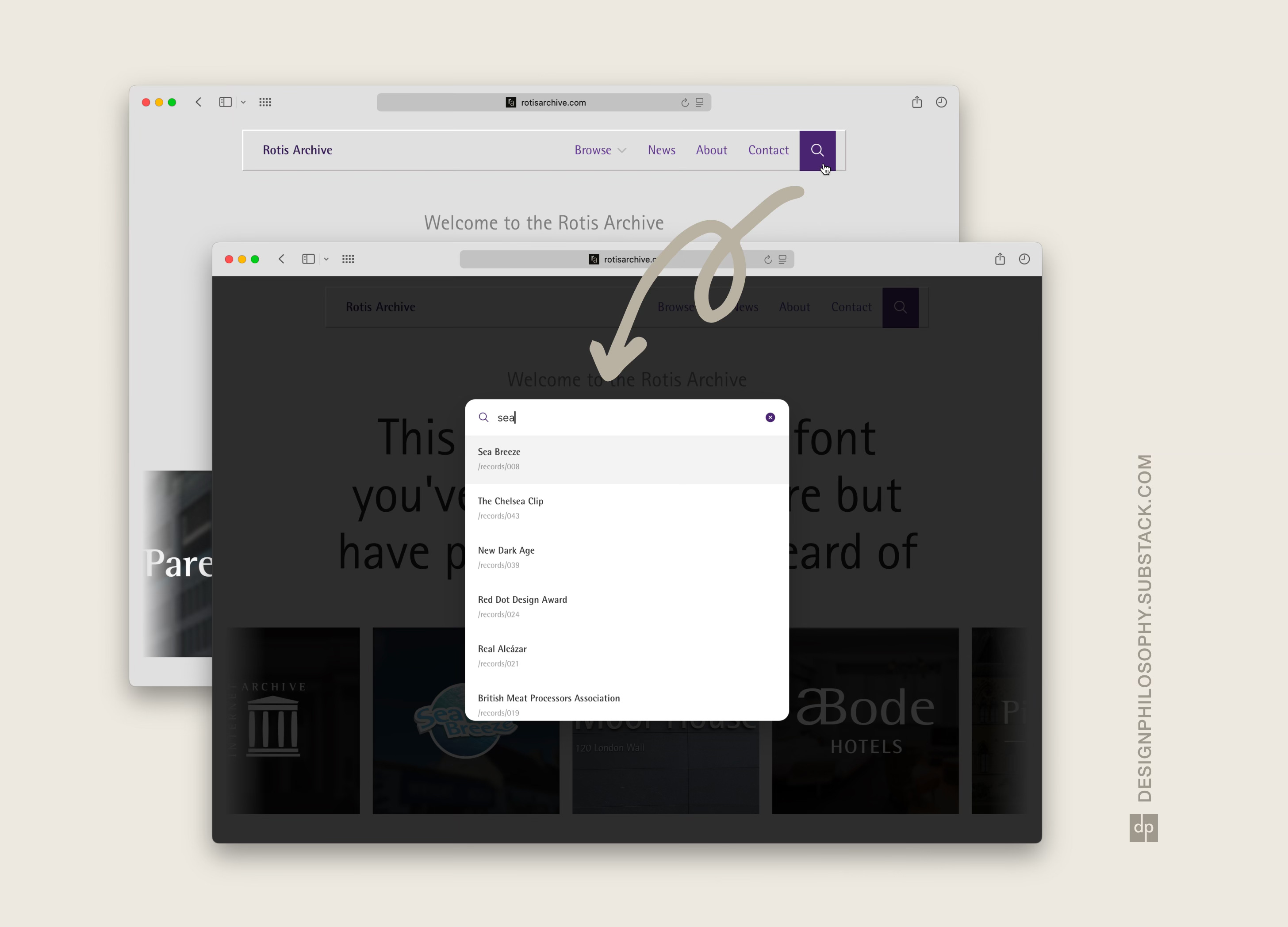
At last, I’ve added site-wide search to rotisarchive.com 🎉
This lets you search across all 58 records on the website. This includes not just page titles, but also page contents.
This solves an immediate need for locating specific records quickly. But it also opens up a question that I first started looking at when I built a journey map of the website.
What are the key interactions on this website which will delight a visitor?
This new search feature makes the website a better archive, but it doesn’t make it any more delightful to explore.
A suggestion I’ve often received is to double down on telling the story of the font itself, supported by records from the archive.
I would like to work on that, but I would also like the archive itself to be fun to explore.
The current homepage design better does the former than the latter. It tells a story while also showcasing some of the records.
It’s functional, but I don’t believe it’s delightful yet.
The records in their currently flat, square state don’t encourage interaction from the visitor. The pages that group records by industry and type just present a filtered down view of the archive. And the bold navigation pane often stands out more than the page content itself!
So, now that the website is functional and has the basic features in place, I want to think more creatively about the key interactions in isolation. I want to elevate the experience of exploring the database.
In essence, I want the rotis archive to be a fun thing to explore, even if you have no interest in fonts!
More to come – have a great week 🏖️
Very sleek having the search bar as a modal. Exciting for more story telling bits to come