

Always start designing for mobile
In Part 19 of my project to build the biggest online archive of the Rotis font, I show you how I designed the mobile and desktop experiences for an 'About Record' page

Back in the early 2010s, when phone screens were getting bigger and bigger, I put forward the view (to much ridicule from people I ran it past) that if a phone’s screen size is deemed to be too small, that’s because the user interface isn’t well designed.
Now, larger screens do provide the benefit of a larger keyboard and more space for reading text and multi-tasking, but I still stand by my point.
When it comes to designing responsive websites, I believe the user’s goals should be just as reachable if accessing the website on a mobile handset as they are on a desktop or laptop computer.
A great desktop experience doesn’t make up for a poor mobile experience.
That’s why it’s recommended to start by designing the mobile breakpoint before the desktop breakpoint.
Because if you can solve interface problems at that level e.g. achieving the right content hierarchy, it’s easier to scale up to desktop where you have more space, rather than the other way around.
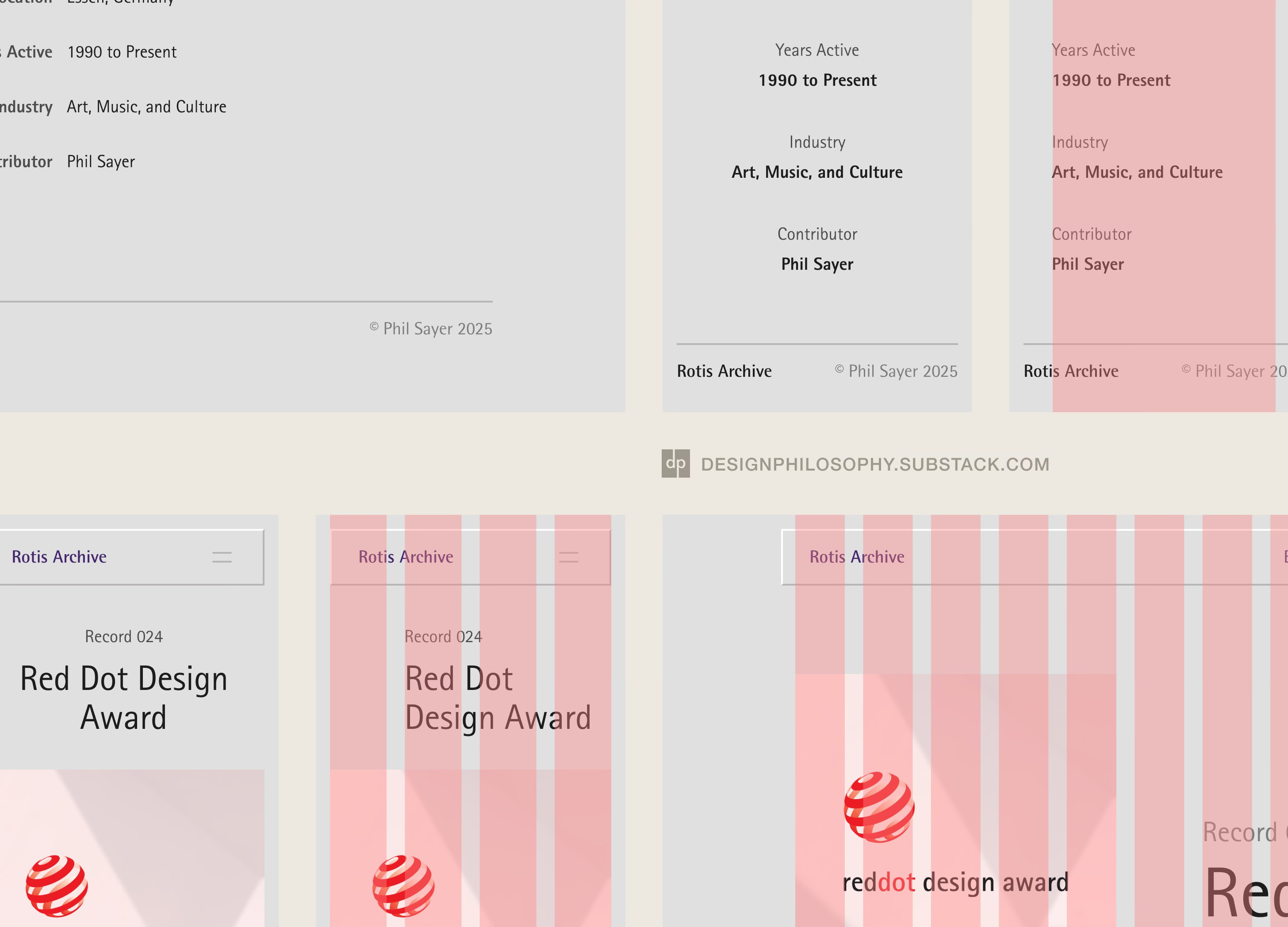
So when it came to exploring designs for the ‘About Record’ page, which shows the details for a single record of the Rotis font, I started with the smallest sensible mobile breakpoint of 350px width. This is a bit wider than the 320px width that defined the smallest ‘Retina’ iPhone screen Apple made; for the iPhone 5s in 2013.
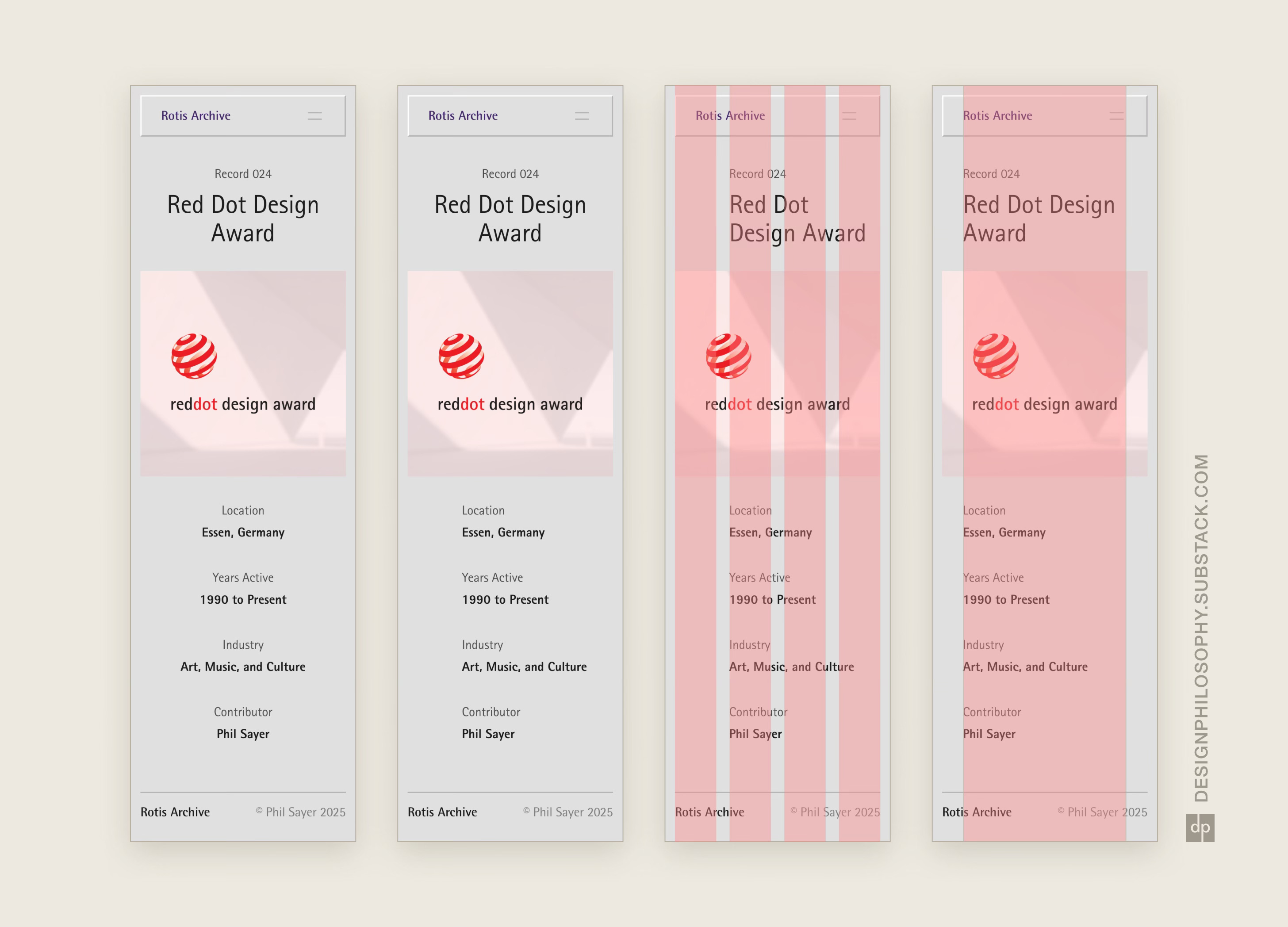
I explored designs that used a 4-column and single-column grid, both of which are common starting points for mobile design.
The single column grid I used was a bit unusual because its left edge aligned not with the standard 16-20px margin, but with the ‘Rotis Archive’ title text in the nav bar. I thought the content had a nice balance if left-aligned in that way.
Yes, the page content itself is quite simple, but that doesn’t mean its layout should be an afterthought.
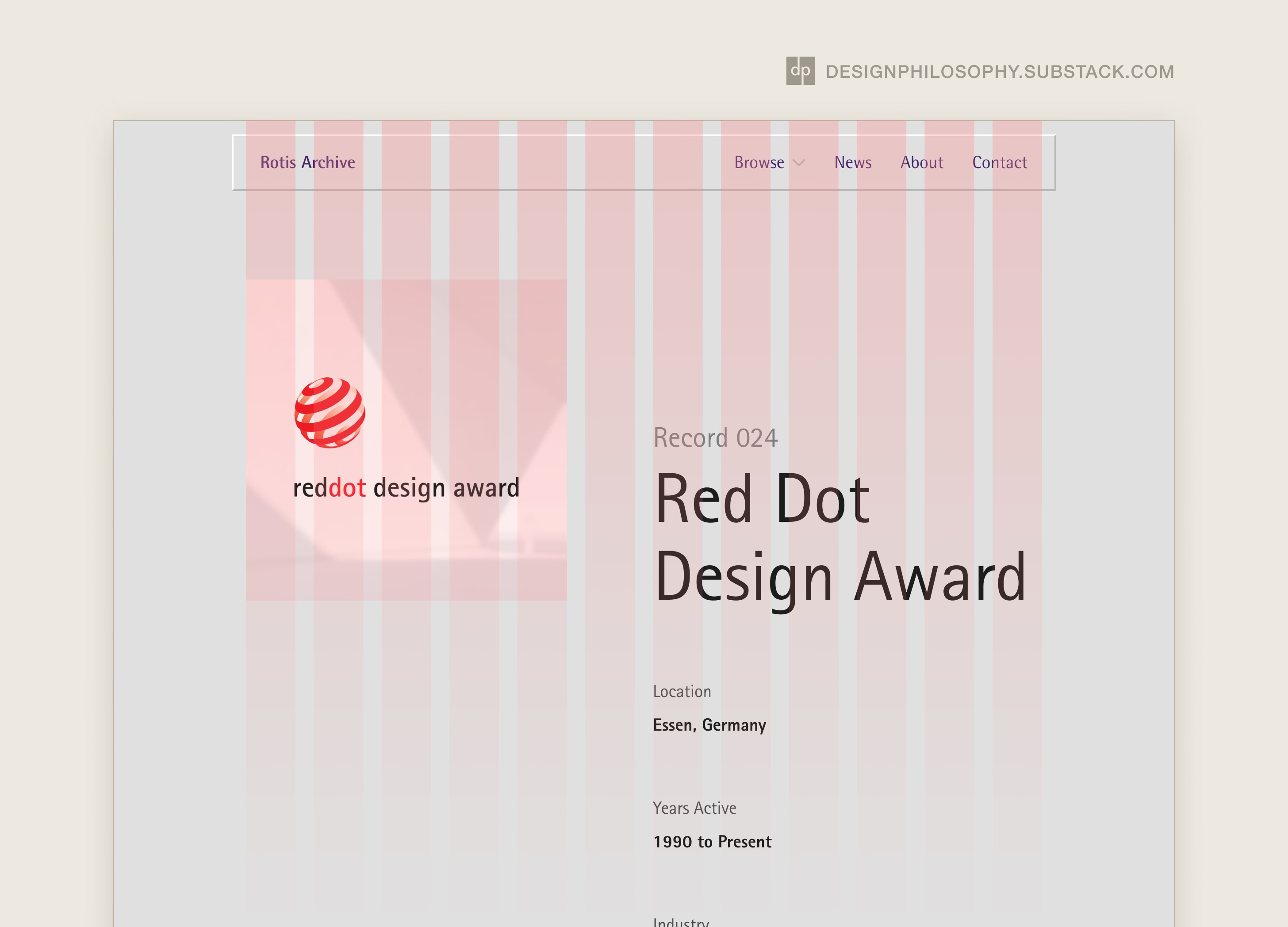
Once I had some mobile design ideas in place, I then scaled them up to desktop.
A 12-column grid was a good starting point, as it could be split into groups of 2/3/4/6 columns, allowing for asymmetrical layouts for variety.
By taking the same content and finding ways to arrange it to make use of the larger screen, I had the freedom to explore what worked best for that breakpoint. Far easier than doing it the other way around.
So there you are; it was a simple page but that didn’t make its design any less worthy of care and attention. Making sure it worked well on mobile was a key first step, before scaling the same content to desktop where it had more room to change shape.
See you next time!
Also worth to consider the 2 column grid for mobile with the typical margins so the content is not indented as well.