Accelerating progress with AI
Part 11 in my series on building an online archive to celebrate the Rotis font
In my last post, I explained I needed to gain clarity on the core experience of rotisarchive.com, before focussing on the look and feel of the homepage.
I found myself at crossroads: should I maintain the original vision of a pure archive, or explore user needs to create a more engaging experience? I chose the latter and began planning a research phase.
But before conducting user interviews, I decided to leverage AI to gain initial insights into potential user needs.
What does AI know about what people want?
I started by telling ChatGPT what I was trying to do:
I’m designing a website which will host a big archive of examples of where a specific font was used. It’s a passion project for now because I’m a bit obsessed about this font, but I want it to be valuable and interesting to others too, both designers and non-designers. I see it serving a similar function to a physical museum or gallery. But I don’t really know why people visit museums and galleries. Could you please shed some light on this? And please give me some ideas for how to apply those principles to this website I’m designing.
It gave me 5 reasons, each accompanied by a way to apply this to my website. Great!
But why stop there? I wondered what ChatGPT might say if I pushed it to be more specific to my project:
Let’s next narrow this down to fonts. What problems do designers and non-designers face when working with fonts in their work and life? What would they need and want to gain from this website to address those problems?
Based on its answer, I decided to push it even further:
My website is cataloguing the history and usage of a single specific font with 4 sub-families. It’s not a website that talks about lots of different fonts. How might the above change with that in mind?
I could see that ChatGPT was overlooking the issue that Rotis isn’t a font that’s commonly used anymore, and pushed it to reframe its advice further:
I would also add that this font isn’t very popular or accessible anymore. So the website needs to be informative to designers and non-designers to teach them how to think when using fonts, not how to apply this specific font
At this point ChatGPT did something interesting. It suggested transforming the website from a simple font archive into a case study in typography decision-making.
And with further prompting, it developed the case study idea into a fully research-driven investigation into why the font became as popular as it did, from not just design perspective, but from technical, cultural, financial perspectives too.
With this approach in mind, what concepts could AI suggest?
So I asked ChatGPT for some ideas for how such a website could be structured:
Could you give me some ideas for a website structure and information architecture along those lines?
One of the features it suggested was a timeline.
Now there’s an idea, I thought. I imagined how it could take shape, and asked ChatGPT what other ideas it would suggest:
Let’s explore the proposed timeline feature in more detail. Let’s say the website has a page dedicated to a single vertical timeline that the user can scroll down on. I’m thinking of putting stops along the timeline for the year a logo was created that used that font, with a vertical bar that continues down the page and stops when the font in that logo stopped being used. That’s one idea. Please give me another 5 ideas for how this timeline could work and why it would be interesting and valuable to people based on our previous conversation above
And by combining a couple of its suggestions, I landed on a concept.
The font's meteoric rise after its introduction in 1988 and subsequent decline in the 2010s presented an intriguing storytelling opportunity.
What if I could surface the relationships between the different brands where this font appeared through a timeline?
How quickly could AI realise this concept?
A timeline of this kind would be an interesting way to draw relationships between the different records in my archive.
But I realised that such a timeline might exceed the capabilities of my platform of choice; Framer.
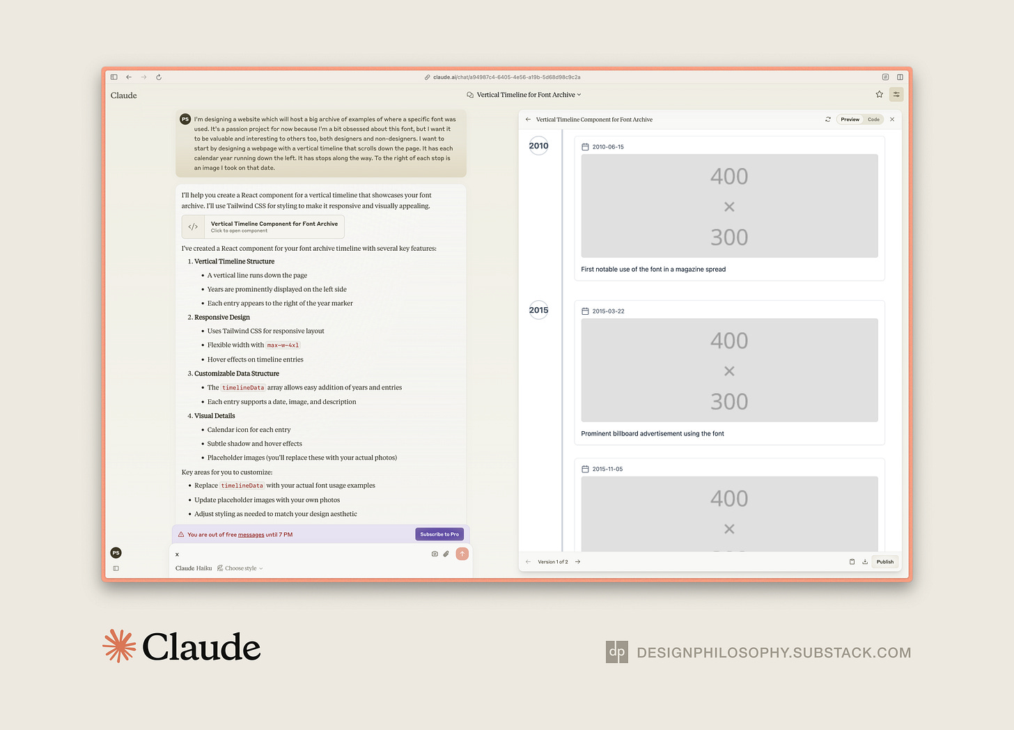
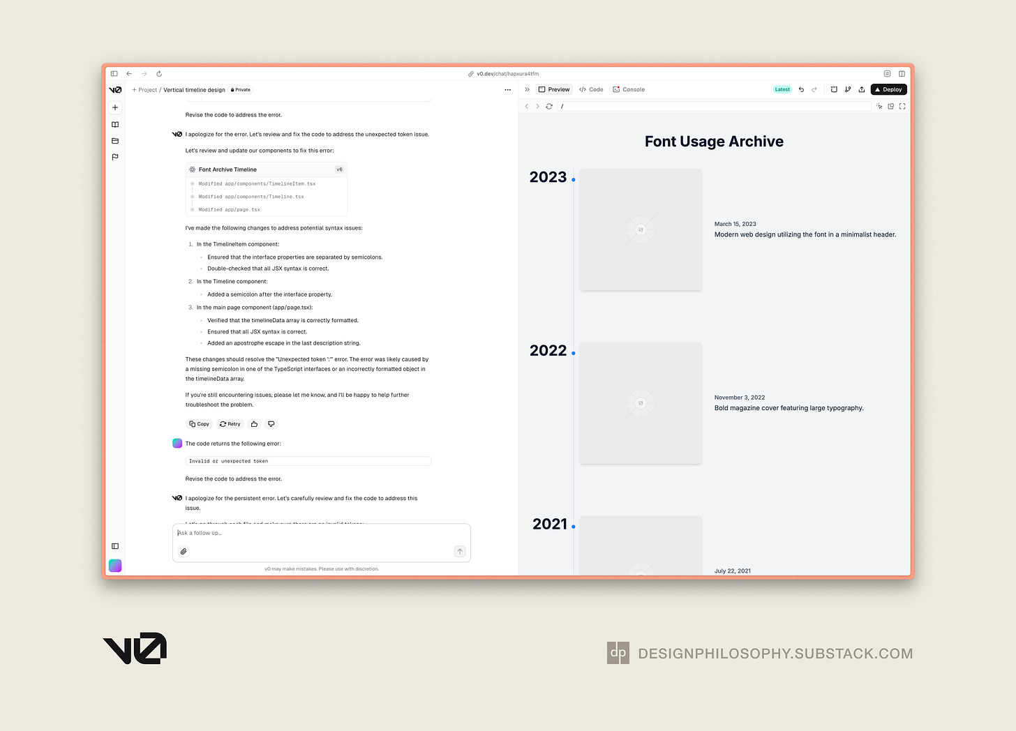
So I starting experimenting with generate AI tools that specialised in website creation. They were Claude by Anthropic and v0 by Vercel.
Using almost identical prompts, here are the very early versions of what they produced:


I noticed a few interesting differences between the two platforms:
v0 was better than Claude at applying visual refinement early on
v0 created a codebase file structure from the start, whereas Claude generated a single file
v0 took a bit more time to generate an updated codebase than Claude
These designs are promising starts, but they need far more development.
And this experiment raises an important question: should I continue with Framer's no-code approach, or pivot to a traditional development stack to achieve more sophisticated features?
More updates to follow!


A marvellous update and interesting angle using AI tools to help you generate new ideas. When I had an idea for graphing different loyalty point redemptions, ChatGPT was able to create a simple chart so easily, but I found that making changes was hard as it would regenerate the whole thing every time instead of just helping me understand the change that was needed.
I will have to check out v0 as it seems it is better for code generation. Lovable is also on my list as people are making a lot of cool thing with it. https://lovable.dev/hall-of-fame
Good luck with the timeline idea, I like how you will be able to tie in what it happening in the world during the different time periods, which brands were at the top, what made them popular and how global trends connected to font usage somehow