


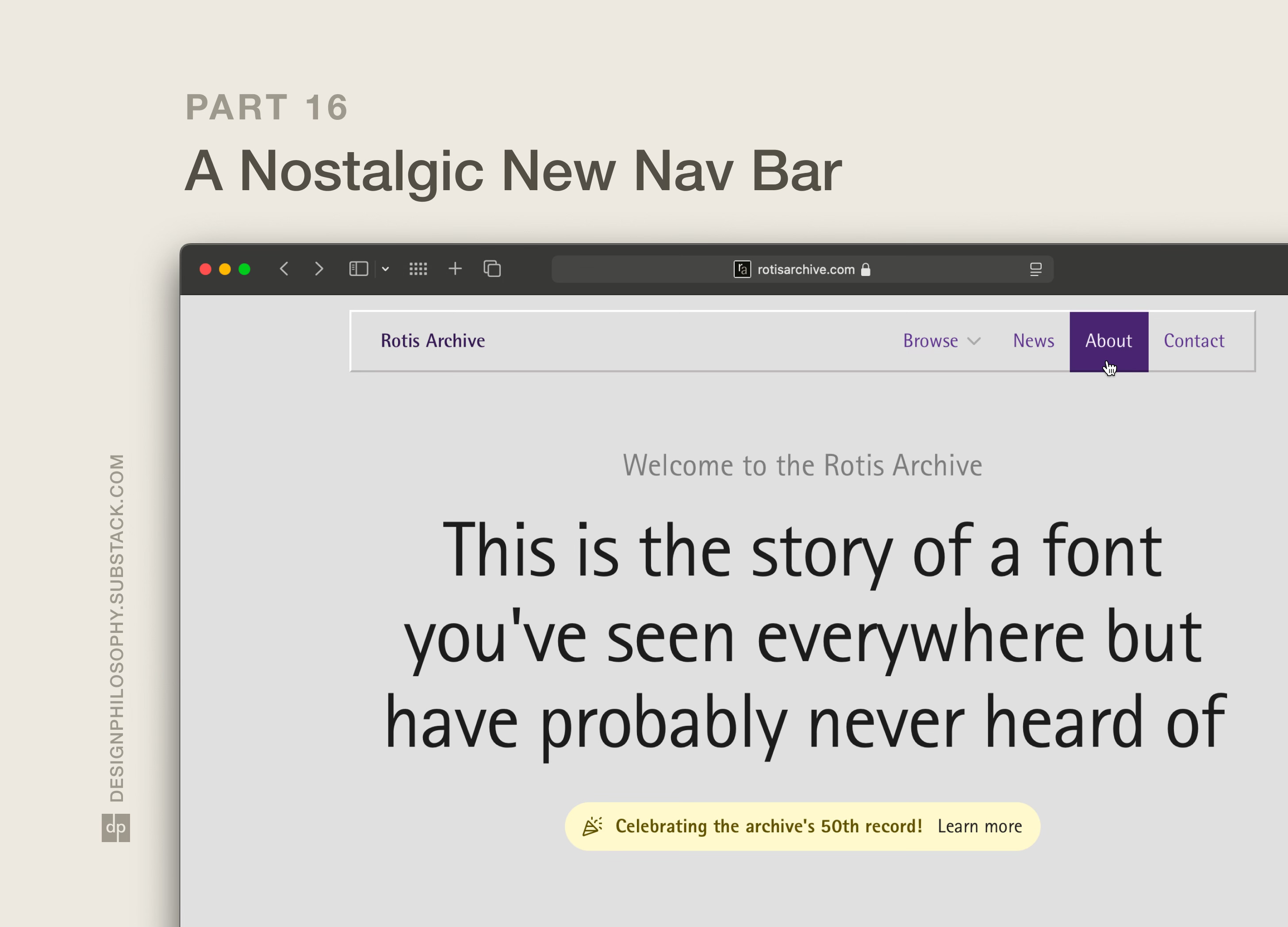
A Nostalgic New Nav Bar
In Part 16 of my project to build the biggest online archive of the Rotis font, I redesign the navigation bar to give the site a 1990s look and feel

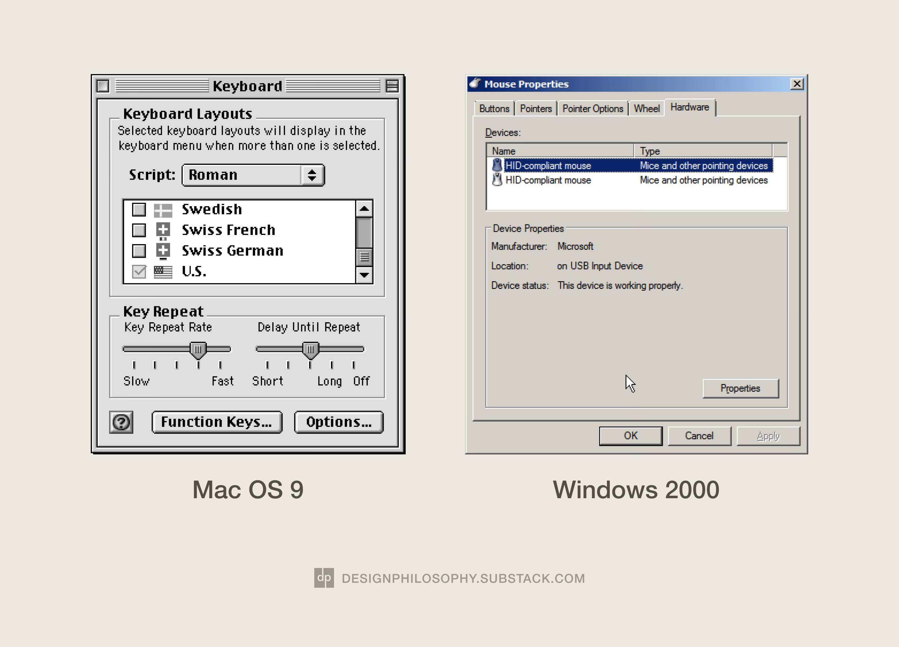
In my last post, I extracted a whole bunch of colour combinations from popular websites from the 1990s and 2000s.
I came the conclusion that beige, cream, and grey were everywhere to be seen.
It was tempting to dive in and experiment with some beige or cream colour scales. But I decided that, because my theme for this newsletter is already pretty beige (I prefer to call it tan 😎), I would instead experiment with a different base colour from my research.
I liked the uniqueness of the lavender and grey combinations I saw in some places.
And I saw potential in combining it with the instantly recognisable chunky button style that littered almost every user interface of the period.
And so I started experimenting to infuse this design into the navigation bar.
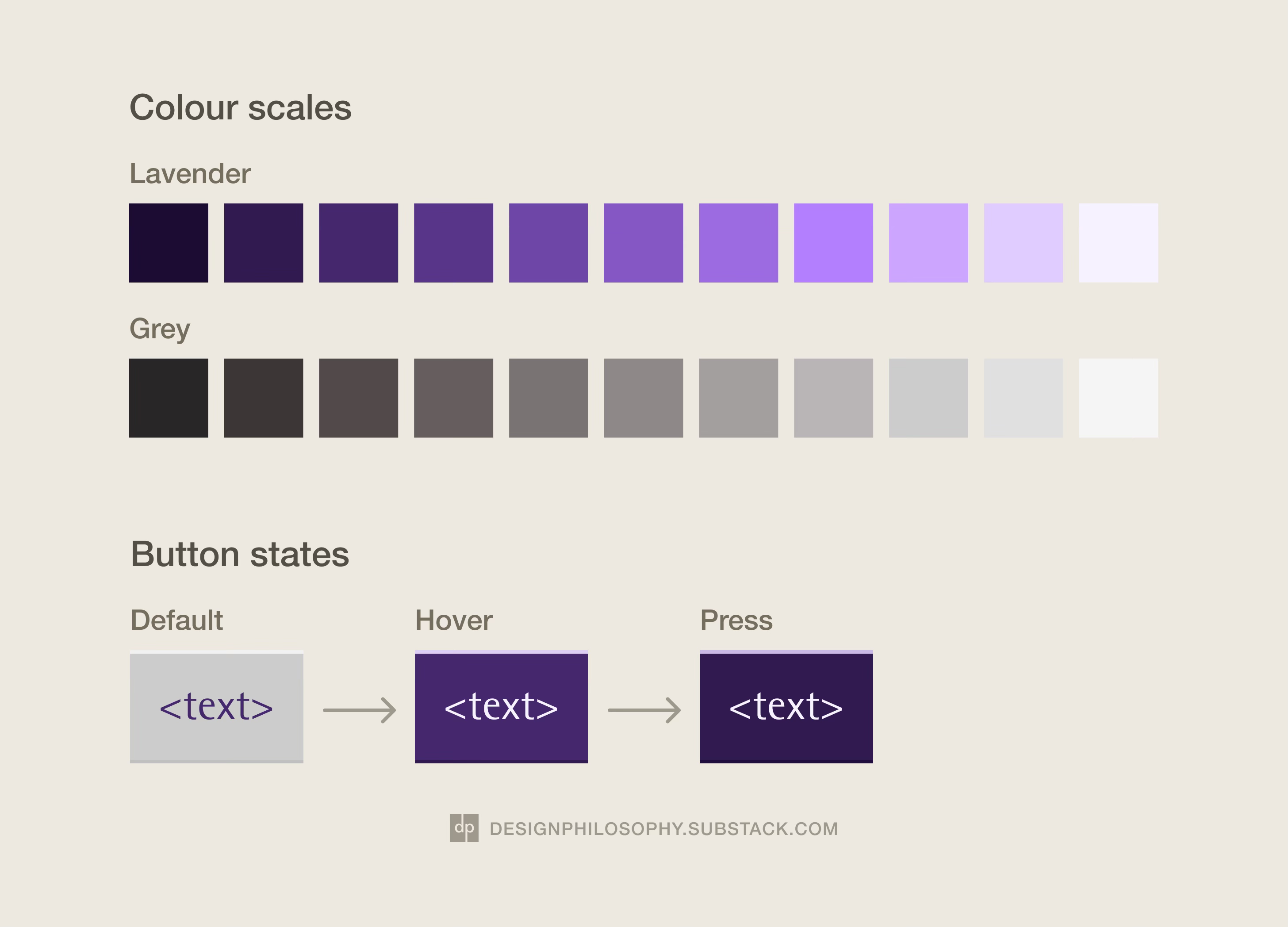
It took a bit time to work out how to replicate the bevel effect using primitive shapes and shadows as I wanted the whole nav bar to appear as one wide floating button.
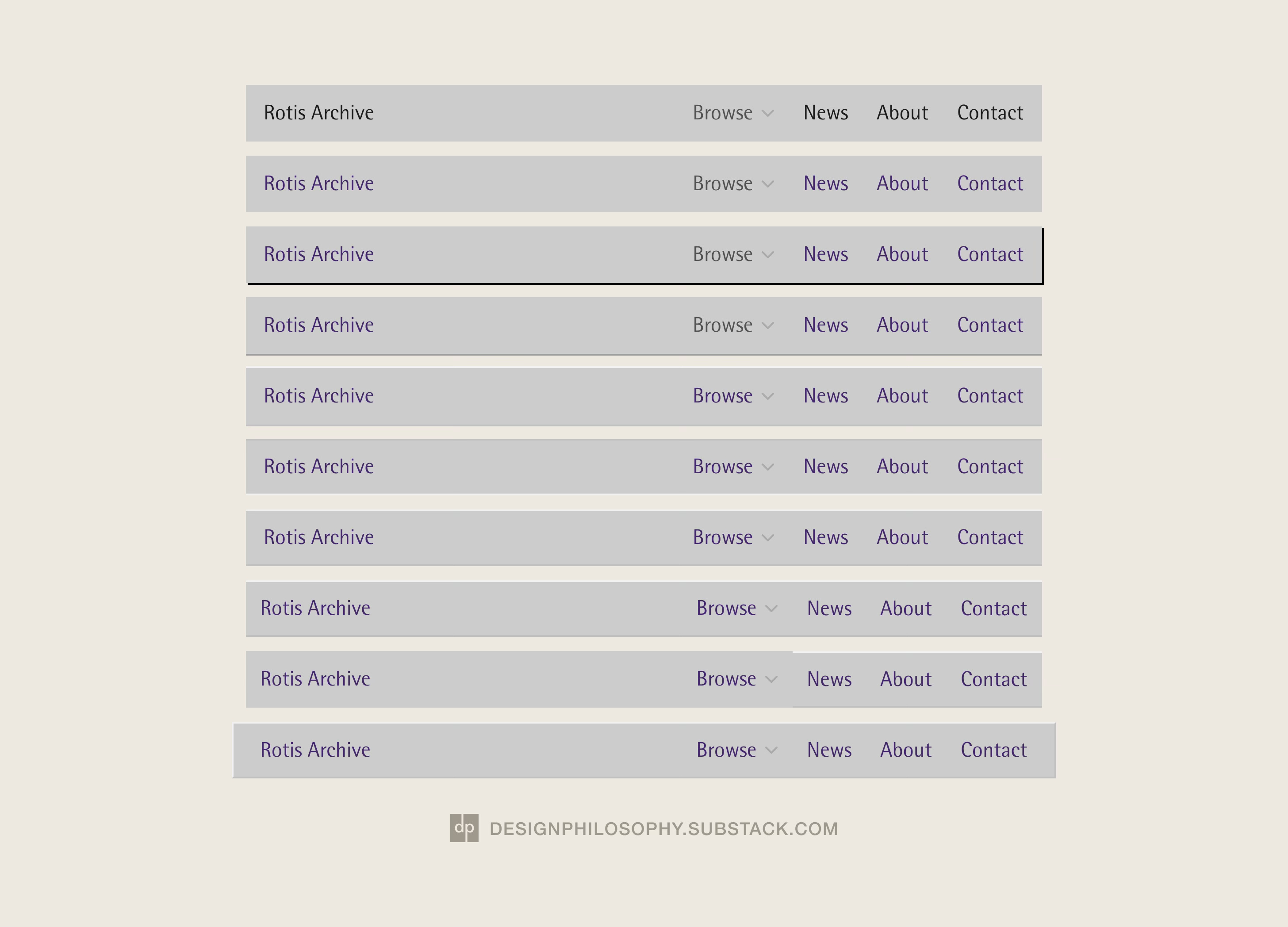
But eventually I settled on the following colour scales and button states.
There’s just one more thing… to inject the nav bar with a hint of modern design, I gave the whole thing a background blur effect. Try it for yourself on the home page!
I’ll now leave this on the back burner for little tweaks to come to mind, before I roll it out across the rest of the website.
Thanks for reading and have a nice week 🍀
Nice subtle background blur, I wouldn't have noticed it if you didn't mention it.
Excited to see how this change will look when it gets rolled out to the submenu