

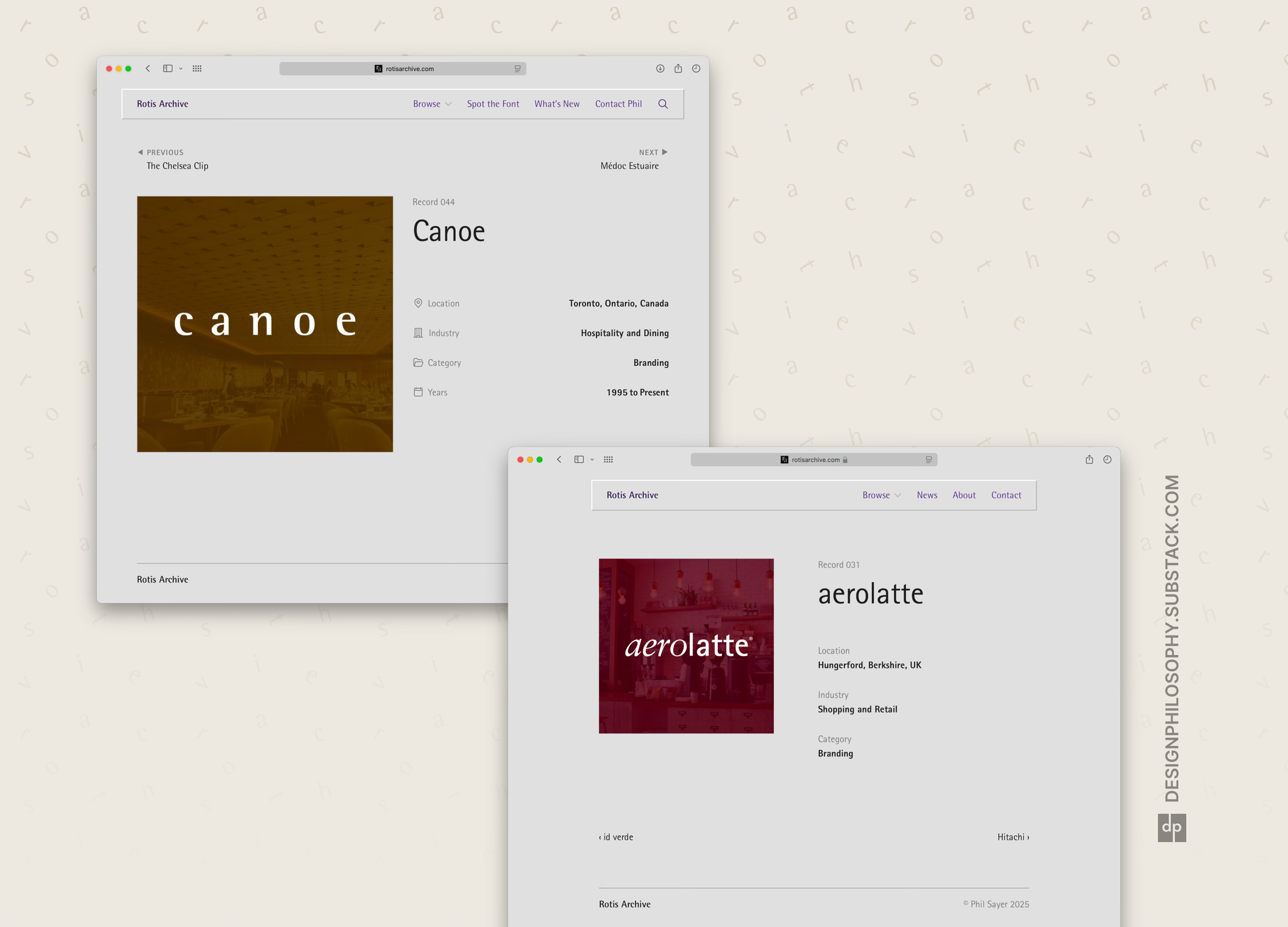
A more refined record display page
In Part 31 of my project to build the biggest online archive of the Rotis font, I work out all the little design details on the record display page

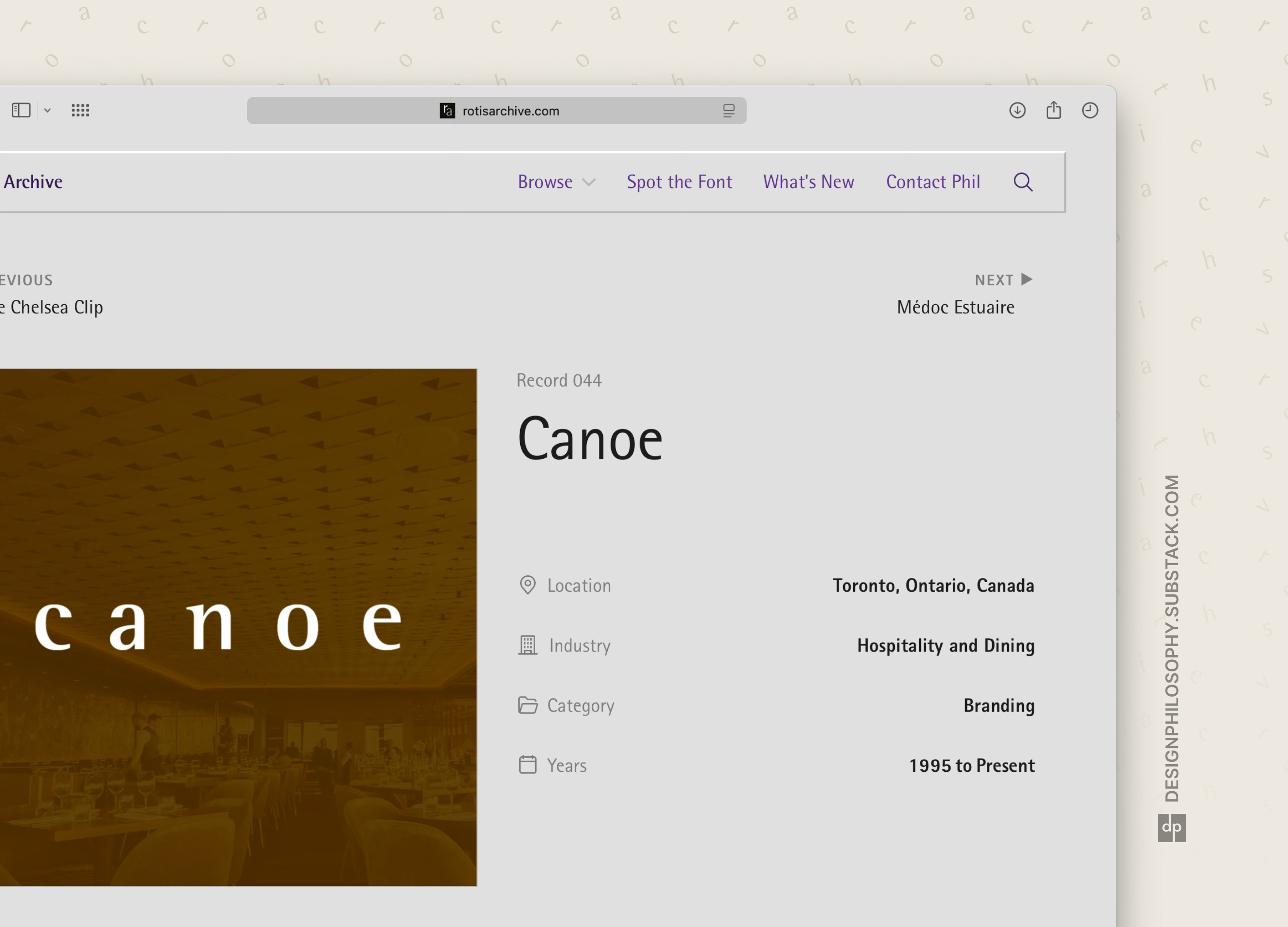
This week was all about tidying up the record display page, including:
Making it fully responsive to different devices and screen sizes
Tidying up the spacing and grid system in the header, footer, and body content
Moving the ‘Previous’ and ‘Next’ buttons to the top (beforehand they would fly around the page as you moved between records, as each record had different lengths of metadata text) and giving them consistent button styling
Adding a ‘light box’ effect on the record images so you can zoom in for a better view
Adding conditional formatting to the ‘Years’ field so that the label for a single date appears as ‘Year’ whereas for a range of dates it appears as ‘Years’. This also meant adding conditional formatting to how date ranges are displayed. This way the years data can be stored cleanly in the Content Management System (CMS) under ‘Start Year’ and ‘End Year’
Adding leading icons to the field titles to make them easier to scan
Check out the final result in the video below – I’m pretty happy with it! 😄
And here’s the before and after for comparison:
As ever, there are still some tweaks I’m weighing up. But I have to draw the line somewhere otherwise this newsletter would never hit your inbox!